Part 2 of this presentation is now available: How to Optimize Your Product Pages for 8-Figure Sales
Hey, Ezra Firestone here!
Welcome to the first video in a 2-part presentation on what I learned from generating $100 million in sales for a single brand over the last 4 years.
In Part 1 I focus on big-picture concepts: I break down 12 things you should at the very least have on your radar if you want to scale to 8 figures.
Then, in Part 2, I focus very specifically on how you can optimize your ecommerce store so that you can turn these 12 big-picture concepts into real sales that will grow your business.
A Little About Me…
I own and operate one of the world’s largest Shopify stores — we’ve done almost $100 million in revenue over the last 4.5 years.
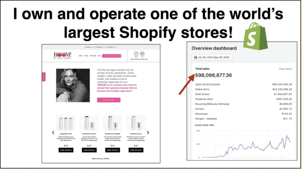
I also build teams. I have 3 companies: Smart Marketer, a marketing education company that sells courses; Zipify Apps, a Shopify application company; and BOOM! By Cindy Joseph, which is my ecommerce company, and the brand I’ll mostly be focusing on the most in this presentation.
When you combine those 3 companies, I’ve actually generated about $140 million in revenue since 2016.
People ask me, “Hey man, you used to work a 9–5 job… You started with nothing… Now you have 3 companies, 2 of them 7 figures a year and one of them 8 figures. How did you do that?“
Well, in this 2-part presentation I’m going to share exactly how I did that. Specifically, I’m going to show you what I learned from $27.7 million in ad spend to generate $98 million in revenue with a single brand.
Now let’s dive into the 12 keys to building an 8-figure business.
1. Product Line Expansion
One of the most important things I’ve learned in my 15+ years as a business owner is this: the game is won or lost on the backend.
It’s not just about selling that one product, your flagship product. It’s about repeat purchases and average order value.
If you’re going to scale to 8 figures then you need to increase your repeat purchase rate, and the best way to do that is to expand your product line. Or as I like to say: go all in on product line expansion.
You want about 30–40% of your revenue to come from repeat customers — whether that means you sell subscriptions, offer upsells and cross-sells, or whatever — and I’m going to show you strategies you can use to do that.
Here’s a look at my revenue broken down by first-time customers vs. return customers:
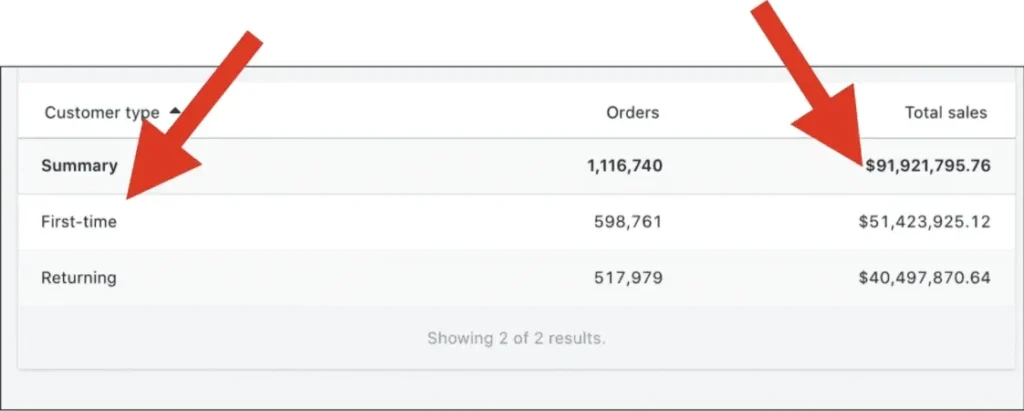
Of the $91 million accounted for here, $40.5 million (or about 43% of my revenue) came from returning customers, while the other $51 million came from first-time customers.
I have two front-end products that I use for customer acquisition — these are the products that almost all of my first-time customers come to me for. Meanwhile, my other 13 products are sold mostly on the backend as upsells and cross-sells.
That’s why you need to expand your product line: so you have more products to sell to your existing customers.
2. Go ALL IN On Email
One way to increase your repeat customer rate is to go all in on email.
Email is still the #1 communication channel between brands and subscribers (the second being ads).
This year, 34% of my brand’s revenue came from sales generated via email marketing, and most brands that make it to 8 figures are generally in that 30–40% range.
What does it look like to go “all in” on email? Take me as an example: I send content emails. I send promotional emails. I use GIF animations in my emails. And every 6 weeks I run a sale campaign.
Here’s my promo calendar from last year:
Ezra’s promotional calendar showing product launches and holiday sales.
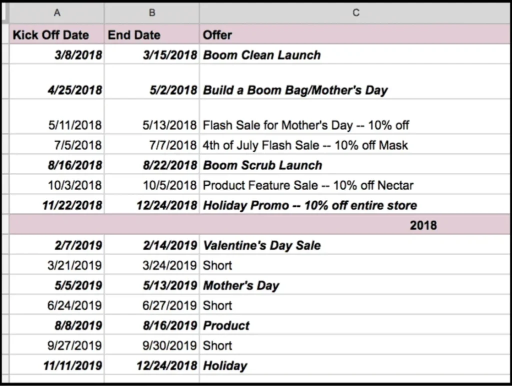
I don’t care if you only have 50 people on your email list, you need to send out a piece of content at least once a month (ideally once a week) that’s educational and valuable — it could even be curated content.
Then every 6 weeks you need to run a sale campaign where you offer a discount. No matter the size of you business, you will generate more revenue if you do this.
Brands in the 8-figure range probably send 3–4x as many email as you do, and in my experience, you can’t send too many as long as it’s good content. When my brand started sending more emails, we didn’t notice our spam rate or our unsubscribe rate go up at all (but our revenue sure did!).
If you want to learn more about the email marketing strategies I use in my Shopify store, check out this free training:
Leveraging Email for Sales and Profit
3. Mine Your Customers for User-Generated Content
“User-generated content” is fancy term for pictures, selfies, videos, reviews, testimonials, and other content created by your customers.
And I use this stuff everywhere — in my ads, emails, landing pages, even on my cart page! I use it anywhere and everywhere I can put it.
So how do you get UGC from your customers? One of our methods is to incentivize them with a $10 gift certificate to our store. In our post-purchase email sequence, we tell them, “Hey, send us an image or a video talking about how much you love your product and our brand, and we’ll send you a gift certificate.”
Then we use those videos in our ads, emails and landing pages:
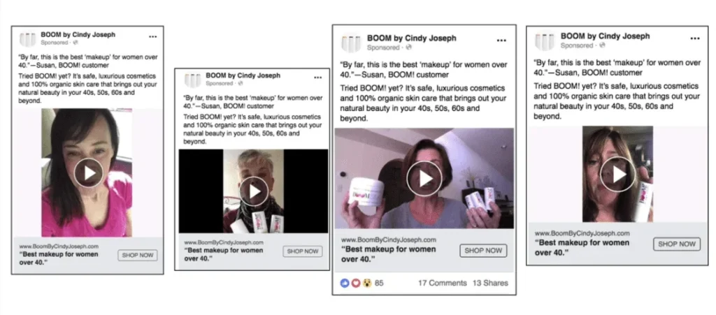
This type of content is our main marketing material. It’s cheap to create and there’s nothing more authentic.
Another inexpensive way to create great UGC is through a brand ambassador program. Check out this article I wrote about how we used an ambassador program to create one of our most successful Facebook ad campaigns ever:
My #1 Facebook Ad Formula: How I Generated $2.8 Million with 1 Cold Traffic Campaign
4. Understand Product vs. Story
When it comes to marketing, most people only understand product. Product is “what am I selling and what are the benefits of it?”
But if you want to get to 8 figures then you also have to understand story, which is WHO you are selling to and WHY they’re interested.
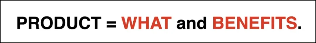
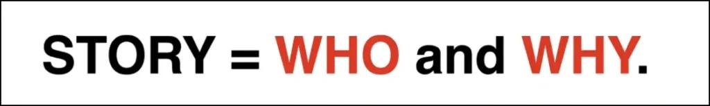
Who’s your audience? What’s motivating them? Once you understand that, you can speak to those people via the stories you tell in your content. This is how you build true community, and definitely what brings people back for repeat purchases.
5. Mobile vs. Desktop
If you want to truly optimize your digital sales process, then you essentially need two versions of your website — a mobile / tablet version and a desktop version.
That’s because these users are completely different: they’re viewing on different browsers and for different lengths of time; your mobile site needs to have less content on it so it can load faster; the list goes on.
If you’re not optimizing for desktop in one way and mobile in another way, you’re missing out on higher conversions rates.
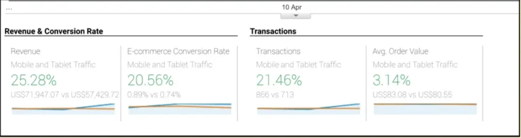
I talk about this a lot on zipify.com (my Shopify software company), and in Part 2 of this presentation I’m going to show you a strategy we used to increase our mobile conversion rate significantly.
6. Ratio of Revenue to Ad Spend
In 2018 I generated $25.1 million in revenue from $6.2 million in ad spend, and from my point of view, I set my budget exactly right.
15–30% of your topline revenue should be reinvested back into paid amplification.
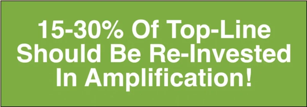
So for example: if you make $1 million per year in revenue, then $150,000–$300,000 should be invested the next year into paid ads to grow the brand. (Remember, $1 million in revenue is not the same as $1 million in profit.)
In my case, 24.7% of my total revenue was spent on amplification, and that was right where I wanted it to be.
This is the fuel that moves the vehicle of your business foreward.
You have to set your budget and spend it. It’s like a diet or a workout program. You have to do it every day.
The Halo Effect
Consistent reinvestment in paid amplification won’t just help you this year; it will help you for years to come.
There’s this phenomenon that happens when brands commit to paid ads — it’s called the Year-Over-Year Halo Effect.
In year 1 and 2 of your ads strategy, your brand generates pixeled audiences, email leads and customers (among other assets). I like to think of this as watering the seeds of your brand. Then in years 3, 4 and 5 these assets start to produce greater and greater returns. I think of this as seeds beginning to sprout and trees bearing fruit.
That’s why years 3–5 are when people tend to hit 7 and 8 figures, and why I advocate for consistent investment every day. Set your budget and spend it.
You Get Out What You Put In
One more thought on the importance of investing in your business: you get out what you put it!
Most people are always asking, “What can I take out of my business? How can I get paid?”
and that’s the wrong attitude.
The right attitude is to ask the questions, “What can I put in? What can I invest? Who can I get to help me? How much more money can I get to invest? How can I not take anything out and let the snowball grow for a couple years before I start pulling from the brand?”
These are the questions to ask if you want to build a big brand.
7. Have a Great Promise (and Product)
Personally, I really like to sell premium, high-price point products. It gives me a higher average order value and more profit per order that I can then use to grow my brand.
So it’s no surprise that most 8-figure brands sell premium products. Some examples are Quip, Allbirds, Tushy, Purple, and M.Gemi.
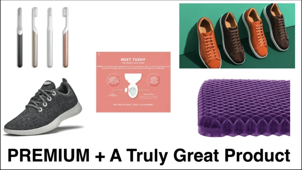
Still, only one of these products is new to the marketplace (Allbirds is sort of the first wool runner). All these other products — tooth brushes, leather shoes, bidets, etc. — aren’t new. They’re just the best in their marketplace.
It’s important to understand that the brand that usually wins in a marketplace doesn’t necessarily need to have the best product — they just need to have the best promise.
The product doesn’t have to be unique or revolutionary or do something other products aren’t as long as they’re making a promise that other products aren’t.
You make this promise with the images, videos and copy you use on your product page, and in Part 2 of this presentation, I’m going to show you the conversion assets you should use on your product pages to do that.
Of course, then the product has to live up to the promise. If you don’t have a good product and your customers don’t like what you’re giving them, then the best marketing in the world won’t save you.
8. Promote Your Products (Use These Hacks)
As I mentioned in item #2 on this list, it’s really important to run sale campaigns and launch new products as often as possible…
But in 2020, we came up with a lot of creative ways to promote our offers that don’t include creating new products or putting existing products on sale.
Some examples of these hacks are: reformulating existing products, new componentry, new sizes, “Back in Stock” emails, bundles and kits.
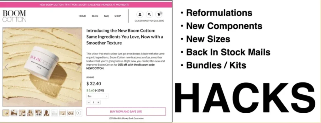
These types of promotions work extremely well, and they allow us to supplement our promo calendar without doing much extra work.
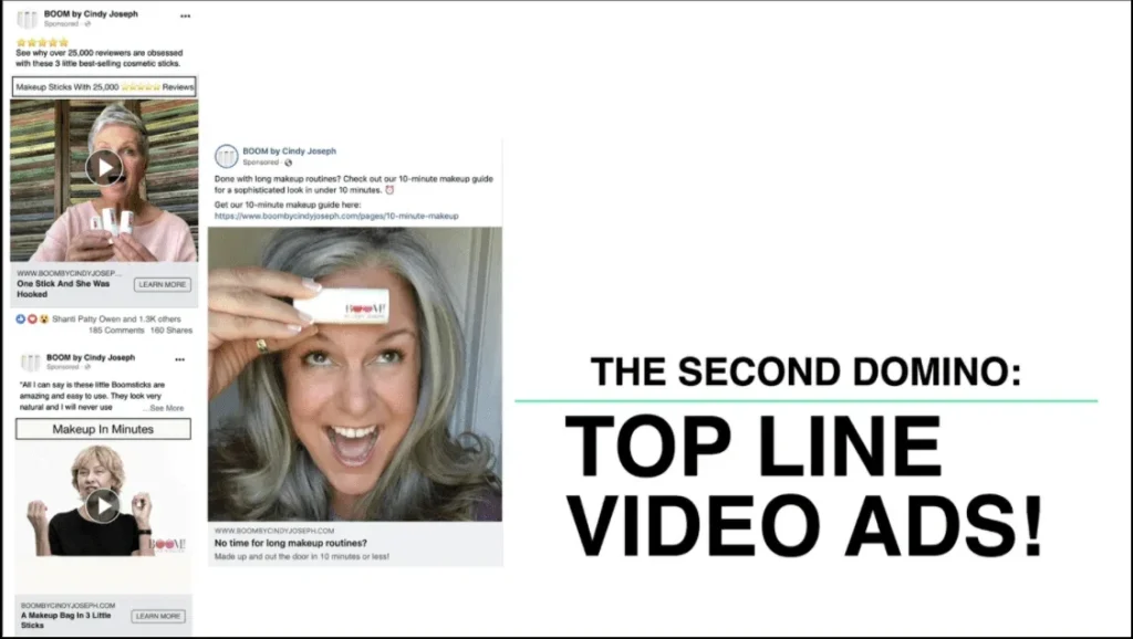
9. Topline Video Ads
You must get good at creating topline video ads. I know a lot of people have been harping on about this over the past couple years (myself included), so I won’t go too deep on the topic here. Still, you need to do it.
My brand has been working on this a lot in 2020. We’re continually improving the ads in our awareness pillar using customer videos that we cut together into different lengths and formats.
The better our topline ads works, the more our retargeting bucket gets filled and the more our loyalty bucket gets filled.
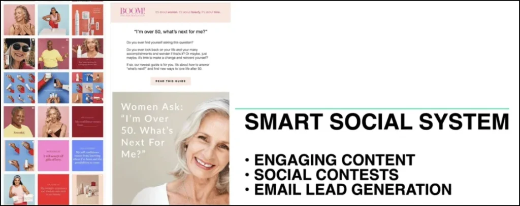
10. Email Leads
This is an add-on to #2. You must be generating email leads.
Every 8-figure brand is not only going out and buying customers via direct response sales funnels, they’re also going out and buying email leads to grow their list.
One of the ways we do this is with a giveaway promotion we run once a month:
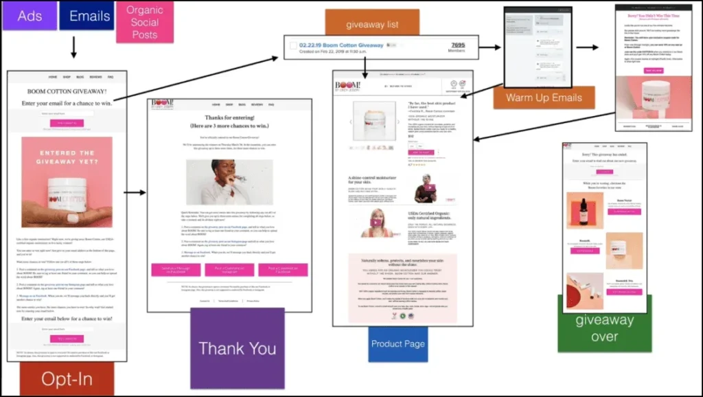
Customers mature at different speeds. Sure, some people might convert within the 28-day window of your Facebook pixel, but others might need to be on your email list for a few months before they become a customer.
We spend 10% of our budget buying email leads, and you should be doing the same if you want to grow your brand as fast as you can.
As I mentioned earlier, you can learn more of my email marketing strategies in this free training.
11. Social Content
After you focus on your direct response sales funnel and email sales funnel, you should focus on your social content.
You need to be creating engagement content like articles and videos, and curating additional content that’s relevant to your audience. I have a customer in my mastermind who sells knives, and he goes out and gets videos of Emeril Lagasse cutting onions and says, “Hey look at this cool video… Oh and by the way you can do that with our knives.”
So as you can see don’t have to create the content yourself.
Half the revenue we generate from email comes from sales, but the other half comes just from content that we send to our list.
Customers engage with our content, end up on our site, and go buy something without our even making an offer!
Want to learn how to use my content marketing system to create a company that is profitable and sustainable because it truly adds value to the marketplace? Check out this free training:
How to Build a REAL Ecommerce Brand Using Facebook, Instagram, Google & YouTube.
12. Pre-sell Articles
Okay, this last one is for you advanced folks out there.
I’ve had amazing success throughout my career with advertorial marketing. This is basically driving traffic to an article that begins as a piece of content but then transitions to a pitch for our products and leads into our sales process.
These articles can be used as topline awareness, auto-responders, retargeting, direct-to-list content, in sale events— you name it.
For the first few years of my business, I sent all my traffic through one of these pre-sell articles which would then link to my website. I’ve literally generated tens of millions in revenue with this strategy.
Keep Scrolling for Part 2…
Those were the 12 key things you need to focus on to reach 8 figures, but none of them will matter if people don’t click that “BUY” button when they go to your store.
That’s why, in Part 2, I’m going to show you how to optimize your store so you can turn these 12 strategies into real sales that will grow your business.
Keep scrolling to get it now.
WHAT I LEARNED FROM $100 MILLION IN SALES (PART 2):
How to Optimize Your Product Pages for 8-Figure Sales
Hey, Ezra Firestone back with you!
Welcome to the second video in my 2-part presentation on what I learned from generating $100 million in sales for a single brand over the last 4 years.
In Part 1, I focused on big-picture concepts: I broke down 12 things you should be doing if you want to scale to 8 figures.
Now, in Part 2, I’ll show you how you can optimize your store so you can turn these 12 big-picture concepts into real sales that will grow your business.
I’m going to focus on the most important pages on your site — your product offer pages. (After all, this is where most people decide whether or not to buy from you!)
Let’s dive in.
The 3 Types of Product Pages
Generally speaking, there are 3 main types of product pages:
-
• Traditional Product Pages
• Long-form Product Pages
• Product “Mini-sites”
I want to quickly run through what each of these landing pages looks like, and when it’s best to use one page type versus another.
Traditional Product Pages
First up, let’s take a look at traditional product pages. This is your old-school ecommerce product page, so it should look familiar:
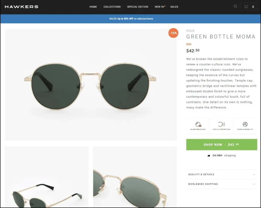
https://www.hawkers.co/products/sunglasses-gold-green-bottle-moma
These pages tend to be image-focused, with lots of eye-catching pictures showing the product from multiple angles.
Meanwhile, there’s not much copy on the page. The product description is often just a paragraph or so.
That’s because back in the day — before mobile traffic took over the Internet — people didn’t scroll as much. If you had content farther down on your page, not many people would scroll down to see it.
So designers started adding things like sliders to websites as a way of taking a brand’s conversion elements (i.e., any piece of content/design on the page that is meant to influence the sale — I’ll talk more about these later), and cramming as much as they could above the fold.
Today, most people use their phones more than they use their desktop, and you have to scroll on your phone. So the issue of people not scrolling isn’t much of a problem anymore.
But even though these traditional pages were designed for a different era, they still work today.
When Should You Use this Type of Product Page?
Here are six use cases when it’s a good idea to use a traditional type of product page.
1) You have a visual product that requires an image-heavy page.
Because these are image-focused pages, it makes sense they would work well for visual products like jewelry, art, home accessories, and clothing.
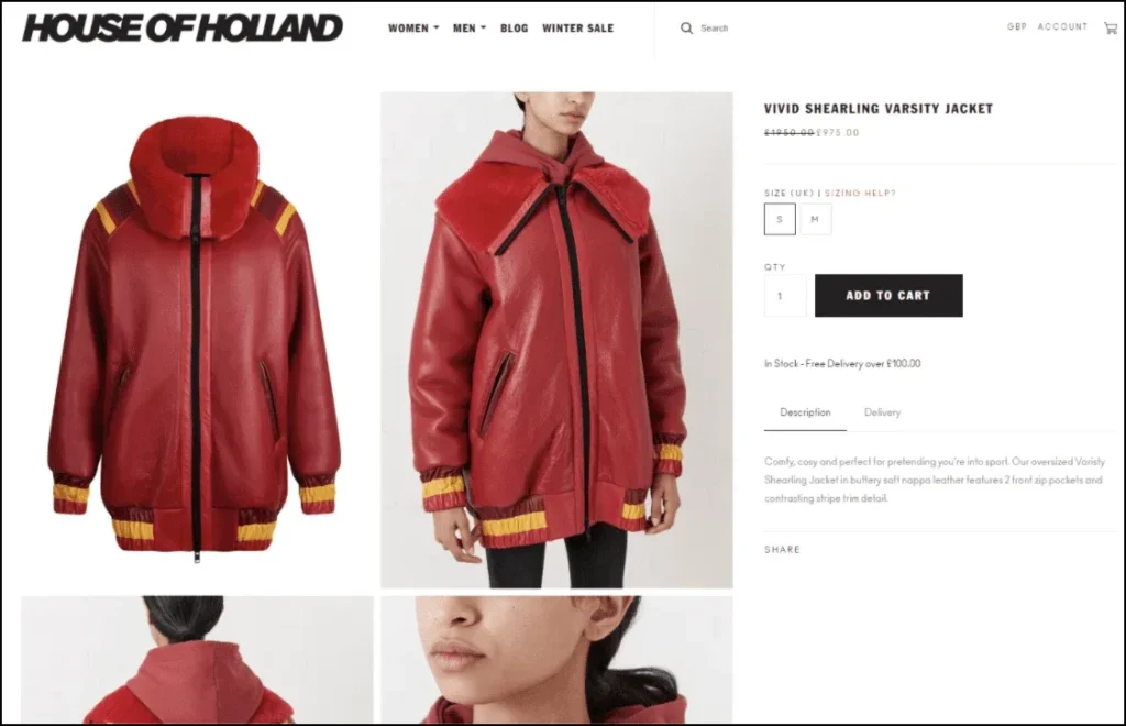
https://www.houseofholland.co.uk/products/vivid-shearling-varsity-jacket
2) When there isn’t a lot to explain about your product.
These landing pages tend to work best when you don’t need much copy to sell your product.
3) When you send people to a strong pre-sell first.
Here’s a question to keep in mind: Where does this landing page fit into your overall marketing funnel?
If you’re driving traffic straight to your landing page, then your landing page will probably need a decent amount of content to convince people they should buy your product (that is, if your product needs explaining).
But if you’re doing most of the selling in a pre-sell article or video, then by the time your visitors hit your product landing page, they’re probably already sold.
4) When the page is intended for repeat buyers.
If you’re selling a product made for repeat purchases — like shampoo or Keurig coffee pods — then most visitors don’t need much convincing to buy.
5) When you’re selling a low-ticket item.
Generally speaking, the less expensive your product is, the less sales copy required to sell it. (A $1,000 product probably needs more content on its landing page than a $15 product.)
That said, if you have good sales copy then use it! No matter the price of your product, it could make the difference between the buyer choosing your product over a competitor’s.
6) When you’re a mobile-focused brand.
Brands that get a lot of mobile traffic tend to use traditional product pages because they contain less content, making them lightweight and faster loading. (Sluggish pages equal sluggish sales!)
However, as I recommended in Part 1, the new trend is to actually build two different versions of your website: a robust version for desktop and lean, fast-loading version for mobile.
(Read more: Make More Money from Mobile Traffic with Zipify Pages’ New Mobile Header)
Long-Form Product Pages
While traditional product pages are short and to the point, long-form pages have a lot of copy, pictures and conversion elements to help educate your visitors and persuade them to buy.
When Should You Use this Type of Shopify Product Page?
Here are six use cases for this type of product page:
1) When you have a direct response marketer in charge.
Direct response marketing is intended to get a person to take a specific and measurable action. On this page, that action is to buy your product.
2) When you have a good copywriter on the team.
It’s also critical to have a great copywriter on your team. These pages are long and full of text, so you want someone who’s able to write clearly and as persuasively as possible.
3) When you have a lifestyle or story-based product.
Because these pages have more room for content, they work really well when your product is based around a certain lifestyle or when you have a compelling story to tell about it.
4) When you can visually demonstrate how well your product works.
Demoing your product is a really powerful selling tool. It helps clarify what your product does and how it works, answers questions, provides visual proof of effectiveness, and helps your visitor to actually see themselves using your product.
5) When you have to educate the person before they’ll buy.
Education is often an issue when you have a product that features new technology that your visitors need to understand.
That’s why Purple Mattress’s sales pages are so long — they need space to educate you about why how they can solve problems like back pain and poor sleep caused by other mattresses.
6) When you’re selling high-ticket items.
Remember: the more expensive your product is, the more selling you have to do to convince people to buy it.
“Mini-Site” Product Pages
The third type product page is a relatively new concept for most physical product brands. It’s the product mini-site.
And this is just what it sounds like: an entire website for a single product.
It’s not a huge website, probably just a few pages. It’s like taking a long-form product page and breaking it up into several smaller pages.
This way, instead of having everything on one long page — your videos, reviews, features/benefits, FAQ, etc. — you can put them each on a different page and link to them through a navigation menu at the top:

The menu at the top makes it easier for people to navigate a mini-site versus scrolling through a super-long page (especially on their phone), so the content is easier to consume.
I’ve been testing these in my ecommerce companies, and they’re out-performing long-form sales pages in most cases.
When Should You Use this Type of Product Page?
There’s one really obvious time to use a mini-site:
When you have a single-item brand.
If your entire brand consists of one main product, then creating a mini-site is your best option. Take Nuraphone, for example.
Nuraphone sells one primary product: high-end headphones that adapt to your unique hearing. So they have a mini-site with several pages all devoted to selling that one product:

https://www.nuraphone.com/
But what if you have multiple products in your ecommerce store? Can you still take advantage of the mini-site layout?
You sure can. In fact, I’ve been experimenting with a new way of using mini-sites that makes them a viable product page template for anyone with an ecommerce store.
How to use mini-sites if you sell multiple products.
Another option is to create a mini-site that lives within your normal ecommerce store. Here’s an example from my brand of what that looks like:
https://www.boombycindyjoseph.com/products/boom-clean
As you can see, I have my main site header at the very top followed by the mini-site navigation below.
That way, people can flip through the pages of my mini-site (in this case, for my product Boom Clean) while still having access to the rest of my store.
These mini-sites are actually super easy to add to your existing Shopify store. Just use my landing page and sales funnel builder, Zipify Pages. With this app, you can implement product mini-sites, long-form product pages, and a ton of other strategies I cover in this presentation.
So, What’s the Best Type of Product Page?
Now that we’ve covered the 3 main types of product pages, the question you probably want to ask is this:
Which of these page types is the best?
The truth is, there’s no right answer to that question. They can all work.
But depending on your product, one type might make more sense than another. If you’re selling a low-priced item that doesn’t need much explaining, a traditional product page might be your best bet.
On the other hand, if your product is expensive and requires a lot of education to sell, then you’re probably better off using a long-form page or a mini-site.
That’s because when it comes down to it, the most important thing isn’t necessarily the structure of your page; it’s the content on the page.
So in the next section, I’m going to show you what type of content — i.e., conversion elements — you need on your product pages in order to maximize sales.
The Content You Need to Include on Your Product Pages to Maximize Sales
When you spend as much time researching product pages as I do, you realize something: A lot of top brands are using the exact same recipe.
And once you know what the “ingredients” are, then building a winning product page becomes a lot easier.
So let’s start by talking about the four most important elements to include on your site, then we’ll break down the individual elements in each section.
The 4 Main Product Page Elements
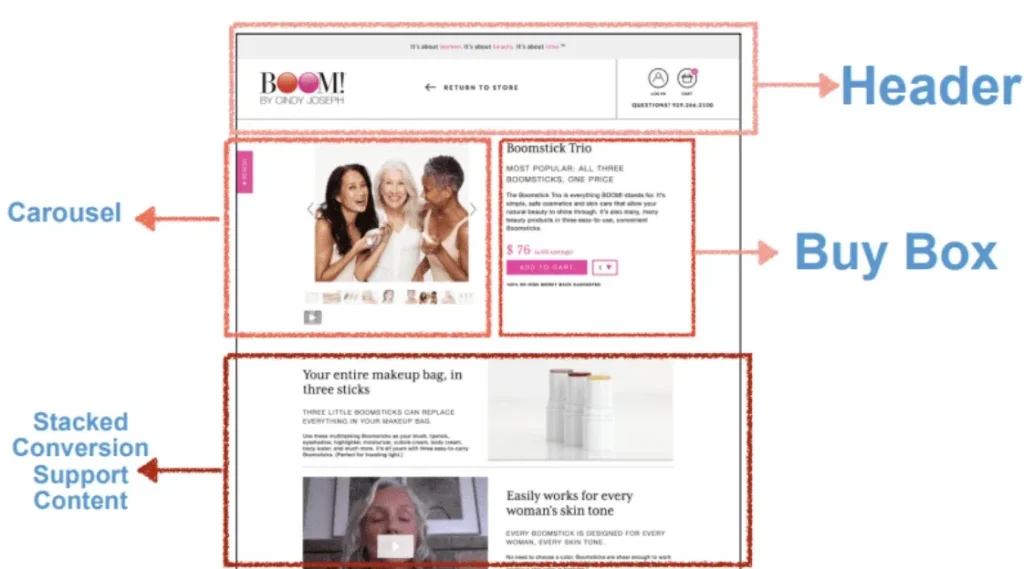
The four main product page elements are your header, your carousel, your Buy Box, and your stacked “conversion support” content.
They might not always be laid out exactly like this, but almost every product page is going to have these conversion elements.
So let’s go through these sections one by one to make sure you understand what each element is, what it needs to accomplish, and how you can get the most out of it.
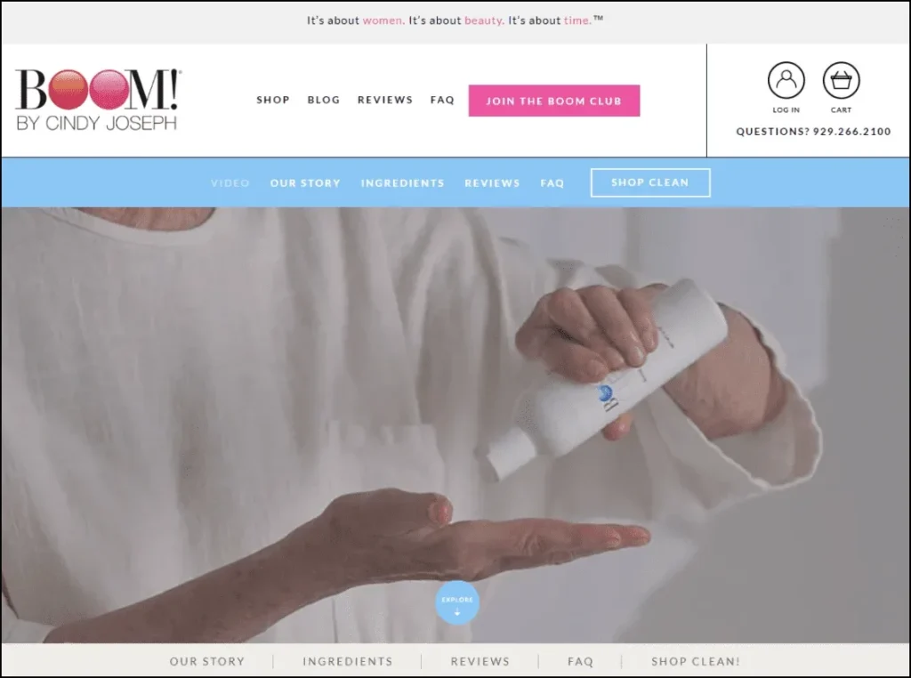
Product Page Element #1: The Header
Just about every online page you’ve ever visited has a header, and you definitely want to have one on all your product pages.
Here’s an example from Purple Mattress:

Source: https://purple.com/mattresses/purple-mattress
Obviously the header goes at the very top of your website. And people are going to expect to find certain things here — like a menu, a link to the shopping cart, and a logo linking to the homepage.
To understand what you need in your header, first you must understand what your header is there to accomplish.
The 6 Goals of Your Header
Your header comes at the top of every single page on your website. It takes up the most prominent position on each page, so it needs to accomplish some really important things.
Here are the six main goals of your product page header:
1) Provide access to any necessary non-product content.
Your header should have a menu that gives people an easy way to navigate your site. They should be able to reach any other important page with just a click or two — like your about page, homepage, support page, and your other product pages.
2) Not get in the way.
Some websites have these giant headers that take up a quarter of the screen, and that’s not a good design.
You header should take up as little space as possible while still being user friendly — about 10% of the screen on mobile and 15–20% on desktop.
3) Be easy to use.
The main goal of your header is to give a good user experience by making it easy for people to use and navigate your site.
This is especially important on mobile, where screen size is more limited.
That’s why we spent over a year developing the mobile header and navigation for our top-100 Shopify store. You can view our new mobile header here.
4) Support the call-to-action.
Many of today’s fastest growing ecommerce brands are using “sticky CTAs” — these are those headers that “stick” to the top of the page even when you scroll down.
Sticky headers are a great place to put a “Buy”button, because it means that no matter where people are on the page — halfway down, ¾ of the way down, all the way at the footer — there’s always a “Buy” button in view.
And you aren’t limited to just one CTA in your header, either. Adding a second CTA can be very effective for increasing email opt-ins and clickthroughs to your store page. Learn more about how to use a double CTA header here.
5) Give easy access to the shopping cart.
You should also have a link to the shopping cart in your header, preferably somewhere on the right-hand side. Online shoppers expect this, and will be confused if you don’t have it.
Note: Not every product website needs a cart page. If you only sell one product then you don’t need a cart, because there’s only one thing for people to buy.
6) Reaffirm your brand identity.
Finally, your header should also reflect your brand.
This means putting your logo on the left-hand side, and adding your tagline (if you have one) on desktop. It helps educate visitors and communicate what the brand stands for.
(Want to learn more about mobile headers? Read our article – Make More Money from Mobile Traffic with Zipify Pages’ New Mobile Header)
Product Page Element #2: The Image & Video Carousel
The next product page element is your carousel. This is where you display your images and videos.
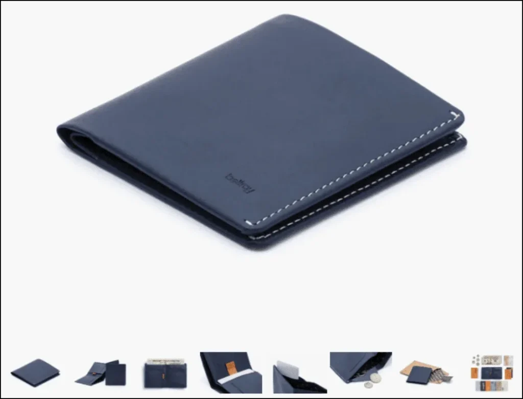
Source: https://bellroy.com/products/note-sleeve-wallet/leather/blue_steel
As you can probably imagine, the carousel is a critical element of any product page. This is where you show potential buyers — not just tell them but actually show them — just how high-quality / beautiful / awesome your product is.
The 6 Goals of Your Carousel
Here are the primary goals of your carousel. Keep these in mind when gathering images and videos for your products.
1) Show off your product.
It’s really important to get this part right. You want your images to be big, bright, and beautiful. Make sure they’re as attractive as possible. Good lighting is essential.
2) Demonstrate the benefits of ownership.
Show your customer how their life will be better once they purchase your product. In other words, don’t just show the product itself — show it in action.
Boosted Boards does a great job with this. They show plenty of images of people using their boards and having a great time. They even include images that dramatize a specific product benefit,like this image that shows how well the board travels uphill:

Source: https://boostedboards.com/boards/boosted-plus
3) Load FAST.
Your carousel needs to load fast. Otherwise, people will lose patience and leave. So make sure your images and videos are optimized.
Take advantage of speedy features like “lazy loading” or virtual images libraries.
4) Have at least 8 “looks.”
Show your product from different angles. Show it opened and closed, turned on and turned off, in red and in blue.
You’ll notice that many of the best-selling products on Amazon do this really well:
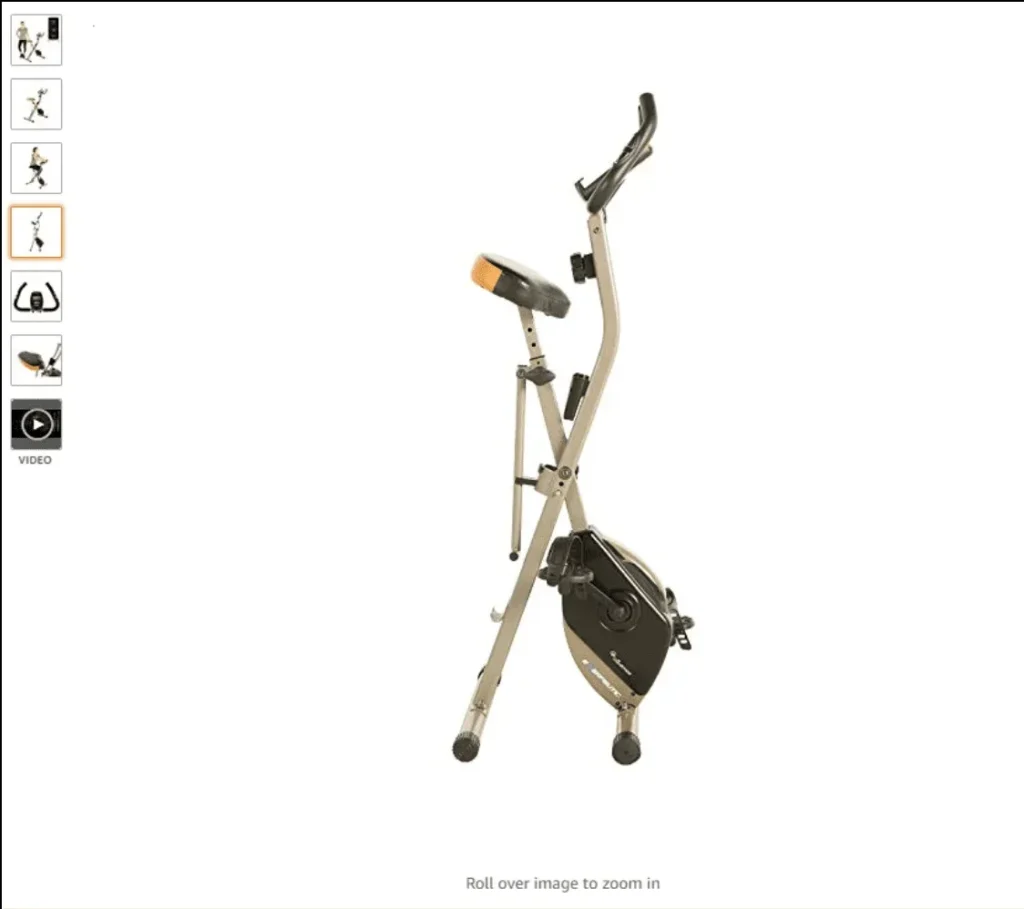
Source: https://www.amazon.com/Exerpeutic-Magnetic-Exercise-Bluetooth-Tracking/dp/B07NPDRF26
In fact, the top Amazon products all have between 6–9 images. More is almost always better, but you should shoot for 8 at a minimum.
5) Build desire for the product.
In ecommerce, people don’t buy your product — they buy your promise. And very often, the second-best or third-best product will beat the first-best simply by making a better promise.
In this picture, Ford is visually demonstrating the benefit of more legroom. Implied in this picture is the promise of a comfortable ride:

Source: https://www.ford.com/suvs/expedition/gallery/#2018-Expedition-gallery-image-ebad7895deada1f4e0a951e631c441cc-ai
So really take the time to think about what promises you want to make with your product, then show those promises being fulfilled as dramatically as possible in your carousel images.
6) Showcase product videos / GIFs.
Last but not least, you definitely want to include product videos or GIFs in your carousel.
A good video can dramatically improve your sales. Purple Mattress, for example, owes a lot of their success to its viral videos — and they wisely place those videos in a prominent spot on their product pages:
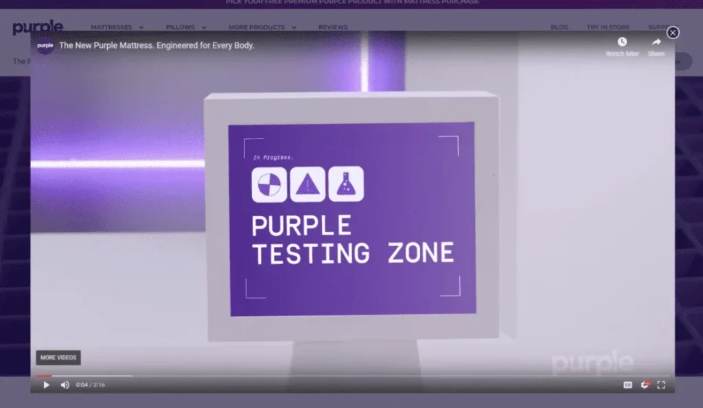
Source: https://purple.com/mattresses/purple-mattress
And look at how Bellroy uses this GIF to show people why their wallets are less bulky:
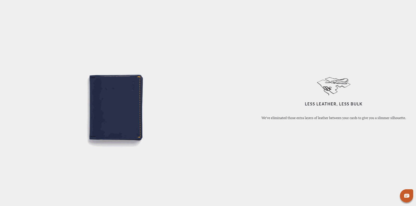
Source: https://bellroy.com/products/slim-sleeve-wallet/default/tan
And like “sticky headers,” image carousels can be used throughout your sales process. Find out how we add image carousels to upsell pages here.
Product Page Element #3: The Buy Box
Next up is your Buy Box. And the Buy Box is essentially where the purchase decision is being made:
As you can imagine, this is a really important element to get right on your product pages. So let’s dive in.
The 4 Goals of Your Buy Box
Obviously, the primary goal of your Buy Box is to get someone to click the “Add to Cart” button and purchase your product. But let’s dig deeper into 4 things that your Buy Box has to accomplish in order to make someone take that action.
The 4 goals of your Buy Box are to:
1) Simplify the sales pitch.
Your product page might have a lot of content on it (especially if you’re using a long-form product page or a mini-site). If that’s the case, then your visitor has a lot of information to digest.
That’s why it’s important to simplify your product benefits to something that’s clear, compelling, and easy to understand.
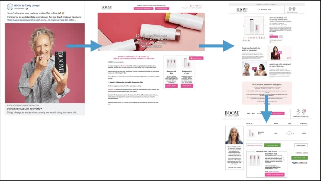
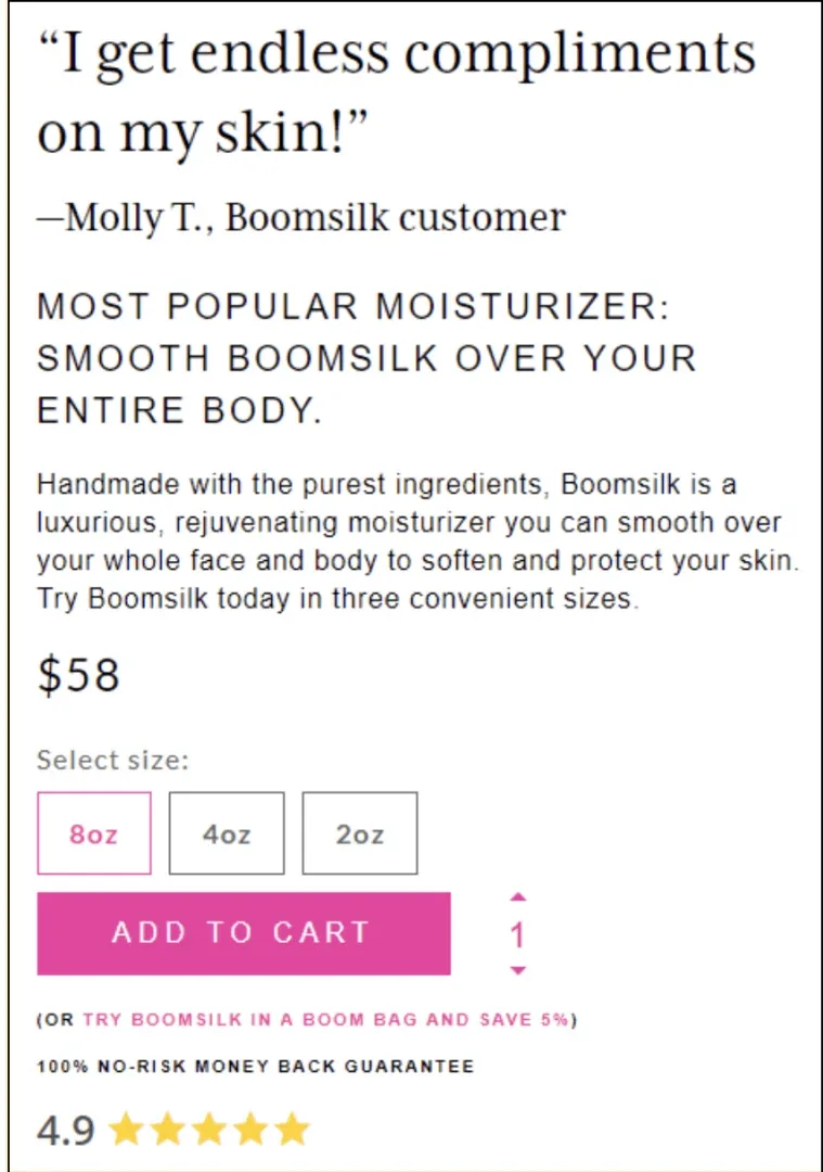
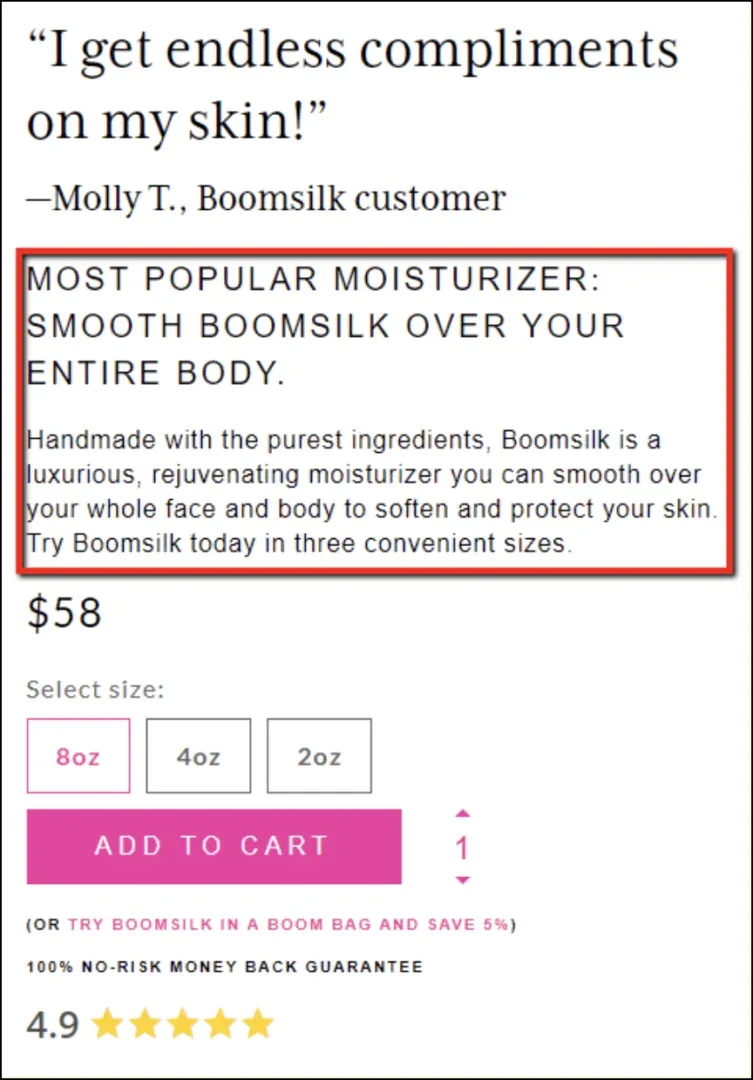
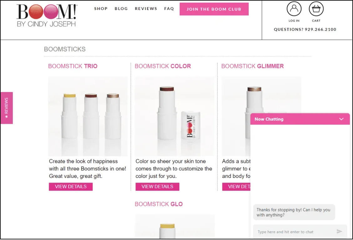
In most cases this means you’re succinctly restating the primary benefits of your product. Here’s an example of this by my skincare brand, BOOM! by Cindy Joseph. The product page for Boomsilk has a lot of copy on it, but it’s all summed up nicely right in the Buy Box:
2) Upsell and/or cross-sell.
Amazon made it popular to add upsells and cross-sells right next to the buy button, giving people the option to add on an additional product or accessory, upgrade to a bigger size or even a bundle, and so on.
Here’s an example of Amazon using this space to upsell you on a protection plan:
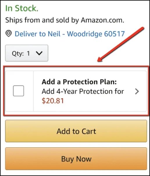
Source: https://www.amazon.com/Bowflex-SelectTech-Adjustable-Dumbbells-Pair/dp/B001ARYU58/ref=sr_1_5
If you’re not sure what product to offer as an upsell, read this article about lessons learned from $1,000,000 in upsells.
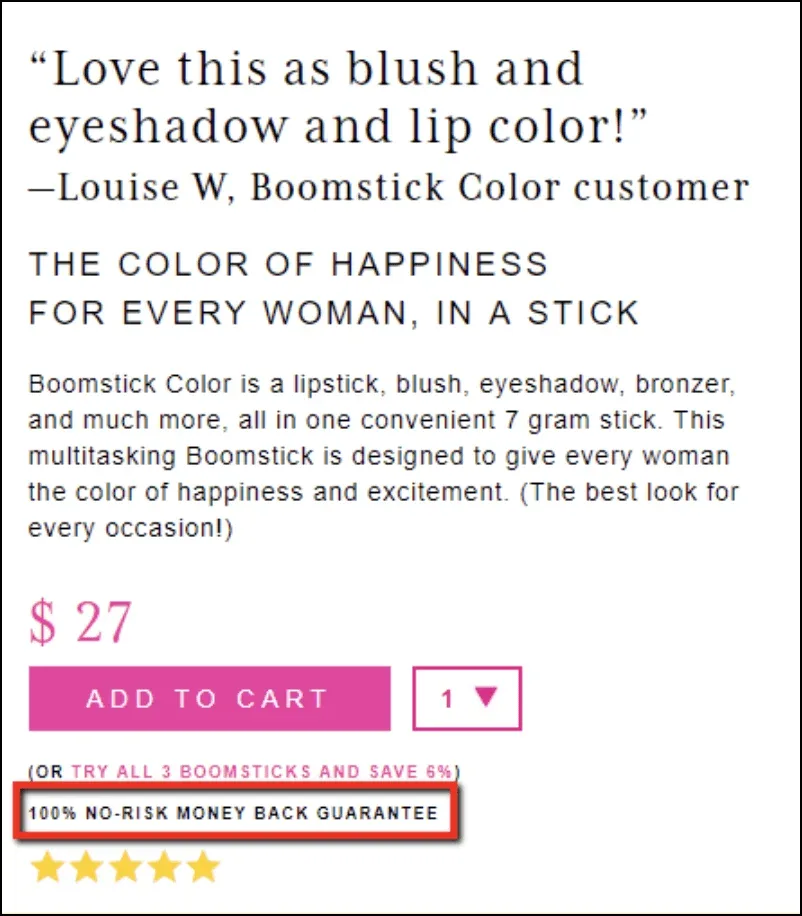
3) Overcome final objections.
Because the Buy Box is so close to purchase decision, you want to do everything you can to overcome visitors’ lingering objections. How?
One really common strategy is to use this space showcase your guarantees. It’s a great way to overcome objections by taking risk out of the equation for the buyer.
Here’s an example from BOOM!:
Spend some time thinking about what your customers’ most common objections are. Is it price? Size? Shipping time?
Once you know what’s holding people back from purchasing, you should address them in the Buy Box.
4) Get the “Add to Cart” click!
Finally, we’re back to the #1 goal of this area: You want the person to click that “Buy” button!
On way to maximize your chances of getting the sale by making that button stand out.
People often ask, “What’s the best color for my buy button?” and the truth is there isn’t one. Just make sure that whatever color you pick is bright and contrasts with the rest of your site. This is called the Isolation Effect.
BOOM! does a great job of this, too. See how our “ADD TO CART” button is the brightest, boldest element on the page?
Product Page Element #4: Stacked “Conversion Support” Content
Okay, we’ve talked about your header, your carousel, and your Buy Box. So what’s left?
Everything else on the page!
We’re calling this your stacked “conversion support” content, because it’s content that you layer throughout the rest of the page to support your other elements and increase conversions.
This content includes additional sales copy, reviews, guarantees, FAQs, and so on.
The 5 Goals of Your Stacked Conversion Support Content
Unlike your header, carousel, and Buy Box — which are all relatively small page elements — your stacked conversion support content can be long. It might make up 95% of your entire product page!
But even though this page element can comprise a wide variety of content, the goal of all this stuff is still pretty straightforward.
The goals of your stacked conversion support content are to…
1) SELL!
You want to convince people that you have a great product that they should purchase. Use this space to do your storytelling and paint a vivid picture of how your product is going to improve the visitor’s life.
2) Demonstrate credibility.
People are skeptical — especially online. That’s why you have to go above and beyond to prove that everything you’re saying is true.
The more credibility you can put on the page, the better. And this credibility can come in many different forms, such as reviews, case studies, research, etc.
Purple Mattress backs up their claims by explaining the technology that allows their mattresses to reduce pressure, sleep cool, and isolate motion:
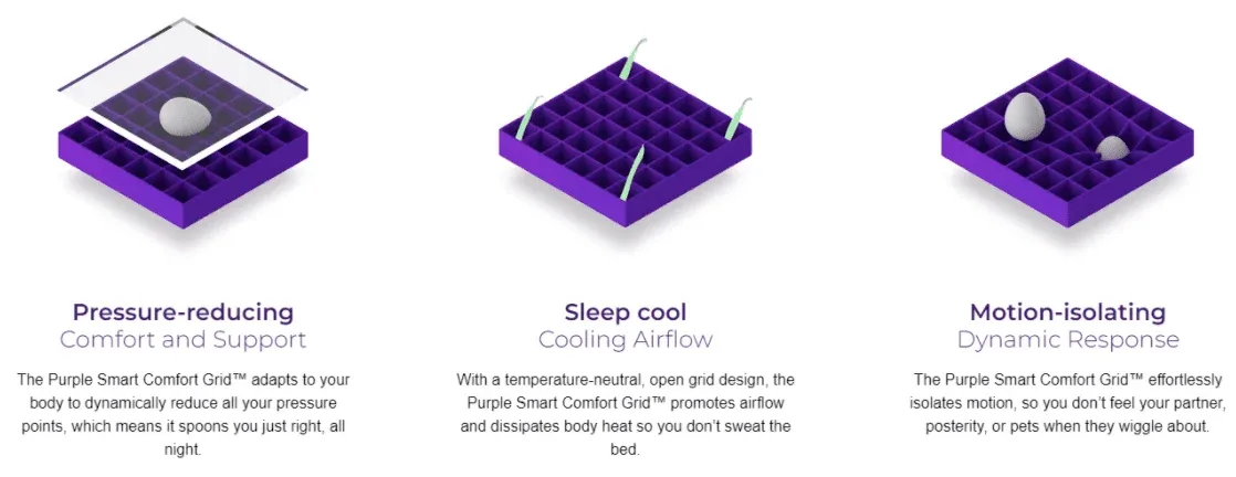
Source: https://purple.com/mattresses/purple-mattress
3) Speak to different types of consumers.
If your product appeals to multiple avatars — different age ranges, income levels, genders, etc. — then this is your chance to talk to each of those groups in a different way.
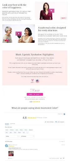
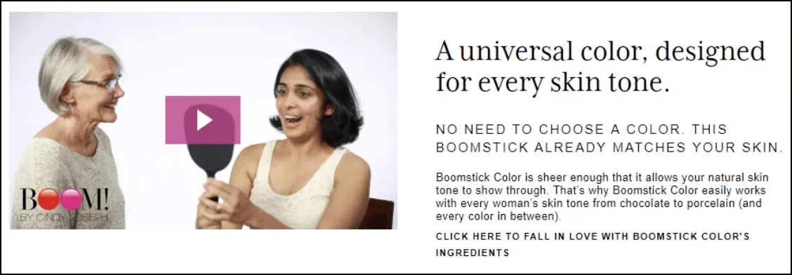
For example, as a company that sells makeup products, BOOM! includes this panel to reassure women that this product is formulated to work for every skin tone:
Also, if your product appeals to several different avatars, then be sure to include all of them in your images. Notice how BOOM! makes a point to show pictures of women with different skin tones in our image carousel:
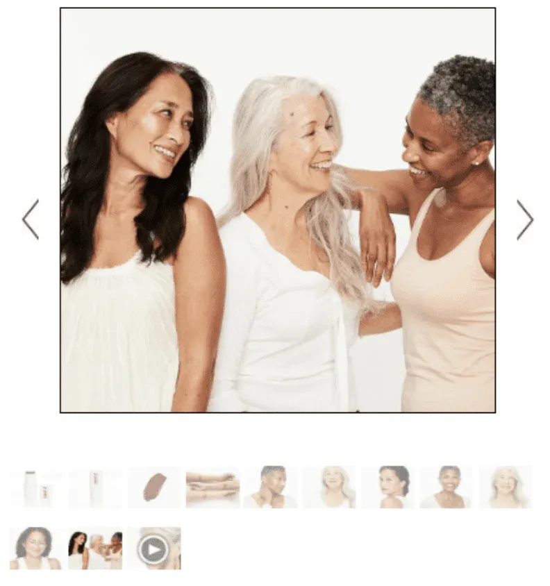
This is a great, nonverbal way to show your visitors that your product applies to them.
4) Overcome objections.
Some common objections include:
• “This is too expensive.”
• “I don’t trust this brand.”
• “I don’t believe this product does what it claims.”
• “I don’t think it comes in the right size/color/type.”
• “I’m afraid they won’t let me return it.”
In your stacked conversion support content, you want to make sure to address and overcome as many of these objections as possible. The more objections you can overcome, the more sales you’ll get. It’s as simple as that.
5) Build desire.
In general, the overall goal of this part of your product page is to make the person want your product. That’s the whole point here: to sell.
Now you might read that and think, Okay, but how do I actually do it? What do I actually DO to overcome objections, build desire, demonstrate credibility, and do all those other things that will come together to generate more sales?
The answer to these questions comes down to one set of deliverables…
Conversion Assets
A conversion asset, or conversion “element,” is any piece of media — like text, image, or video — that supports a prospect in making a buying decision.
And these conversion assets are actually the whole point of having a product page in the first place, an idea that I sum up in my Conversion Asset Theory:
“Fundamentally, your product page is simply a collection of conversion assets working in concert with one another to support you in your goal (a conversion) and the prospect in their goal (a solution to their problem).”
In other words, a product page is just a collection of conversion assets. Just like a car is a collection of parts, and a computer is a collection of chips and circuits and stuff.
So next, let’s go over the essential conversion assets that every product page should have.
16 Must-have Conversion Assets For Your Product Pages
Here are the most important conversion assets that you should have on all your product pages, along with an example of each.
1. A sticky header that supports your call-to-action (this will be different on desktop vs. mobile, but they both need to support your CTA):
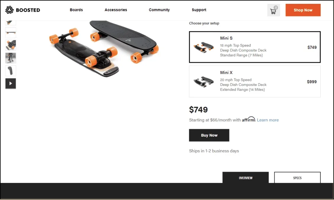
Source: https://boostedboards.com/boards/boosted-mini
2. Multiple high-quality product images:
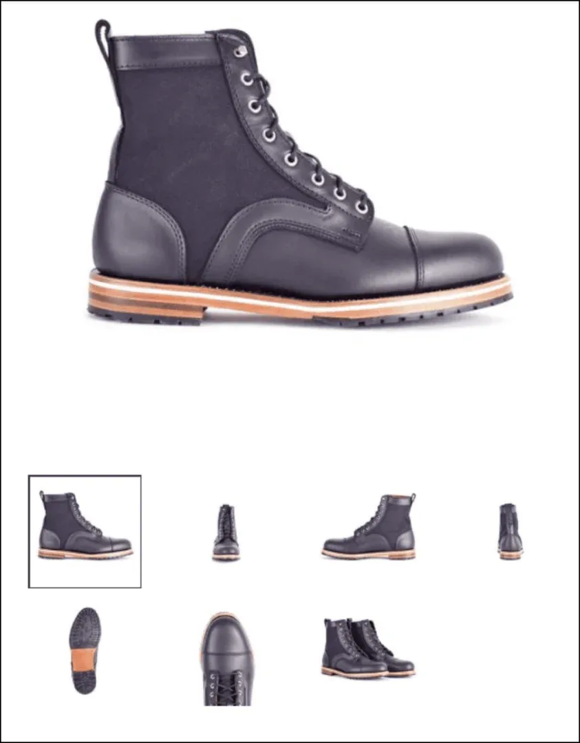
Source: https://helmboots.com/collections/sale/products/adreon
3. Image zoom, so people can see your product in greater detail:
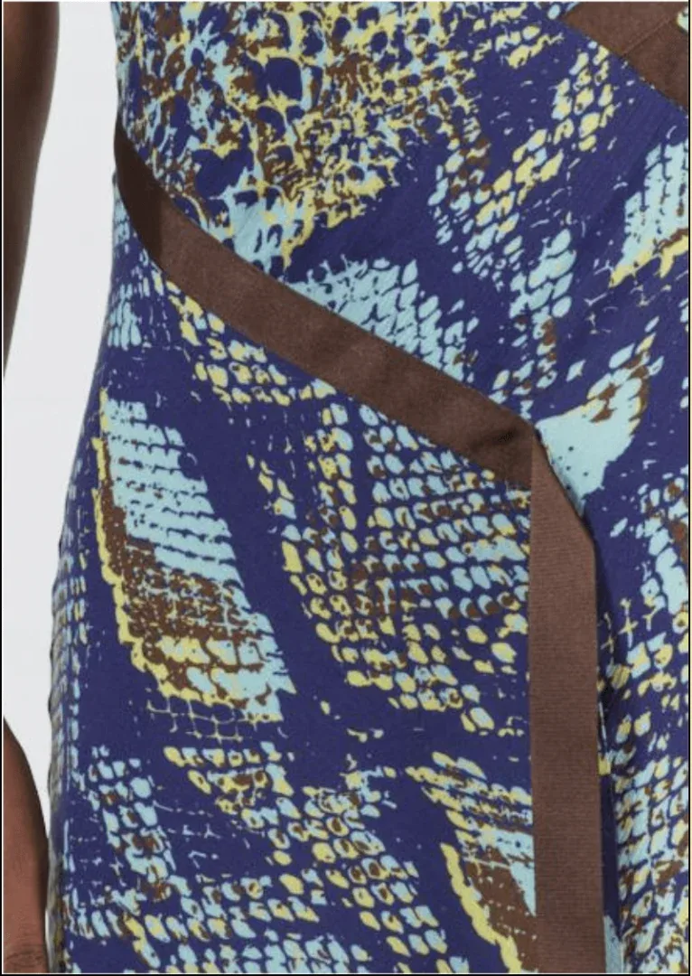
Source: https://www.houseofholland.us/products/snake-print-one-shoulder-slip-dress
4. Product sales video or GIF showing off the product in use:
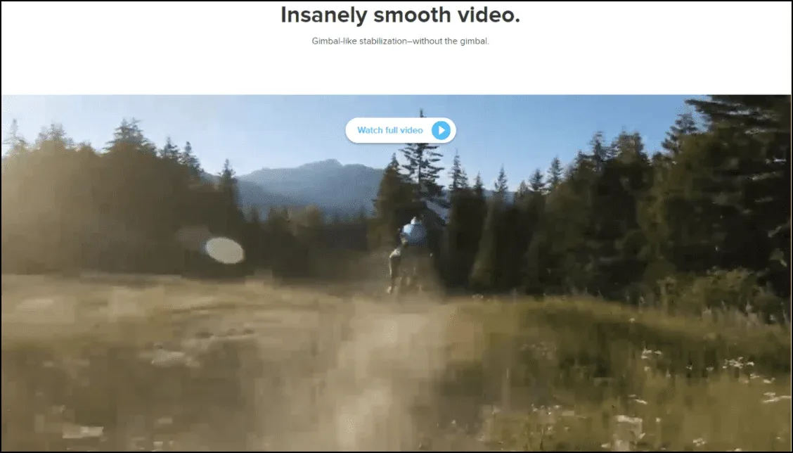
Source: https://shop.gopro.com/cameras/hero7-black/CHDHX-701-master.html
5. An “Add to Cart” button that’s visible above the fold, along with multiple other CTAs on the page (especially if it’s a long-form page):
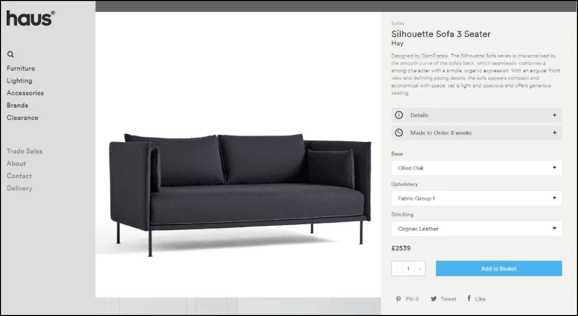
Source: https://hauslondon.com/collections/sofas/products/silhouette-sofa-3-seater-by-gamfratesi-for-hay
6. A pre-purchase “order bump” upsell:
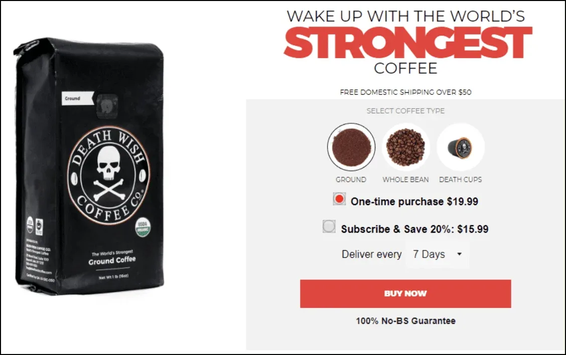
Source: https://www.deathwishcoffee.com/
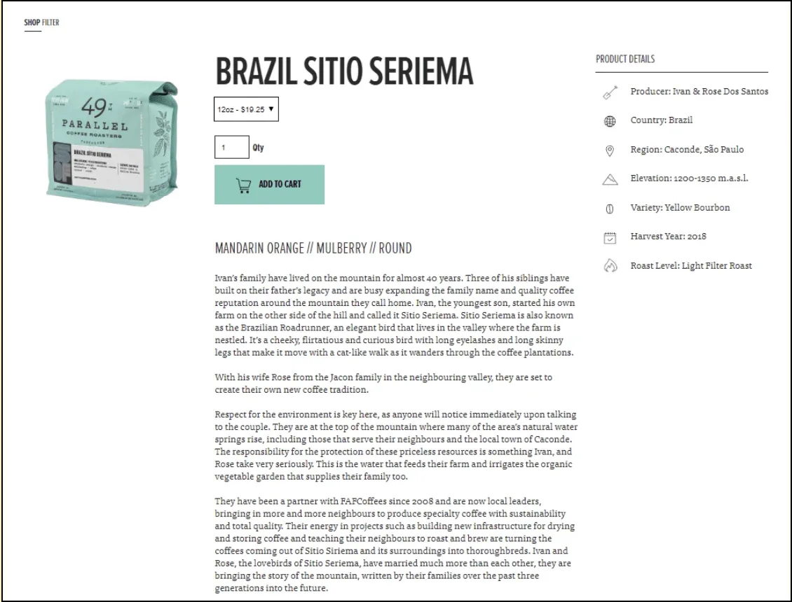
7. Well-written product description (headlines, bullets, etc.) where you tell the story of your product and explain its many benefits:
Source: https://49thcoffee.com/products/brazil-sitio-seriema
8. USPs (unique selling propositions) in image format. These are benefits of your offer in addition to the product itself, like “free shipping,” “locally made,” and “cruelty free.”

Source: https://www.boombycindyjoseph.com/products/boom-nectar
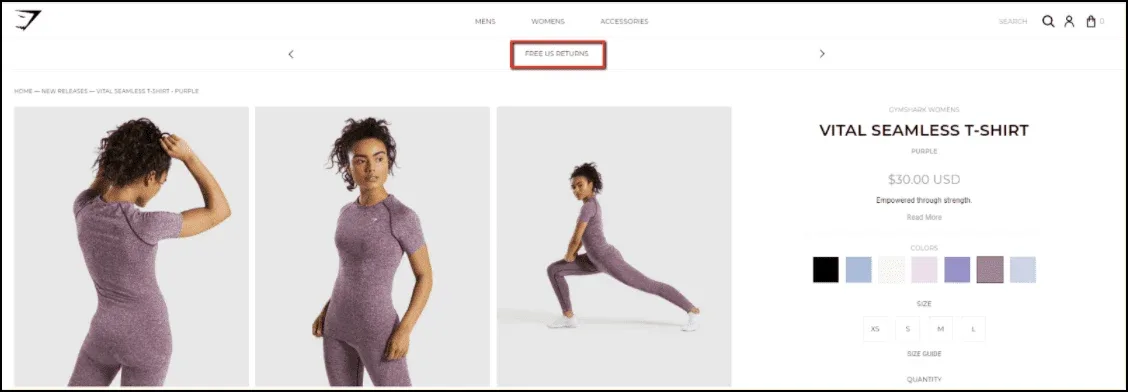
9. Prominently displayed guarantees demonstrating that you stand behind your product:
Source: https://www.gymshark.com/collections/new-releases/products/gymshark-vital-seamless-t-shirt-purple
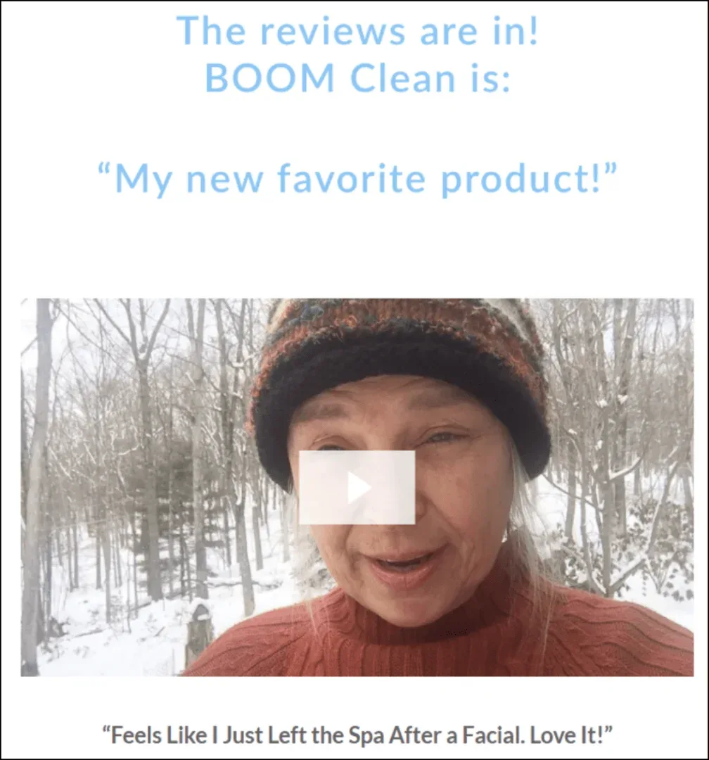
10. Reviews (written and video):
11. Social proof images and videos that show people as they’re enjoying your product:

Source: https://boostedboards.com/boards/boosted-mini
12. Frequently asked questions:
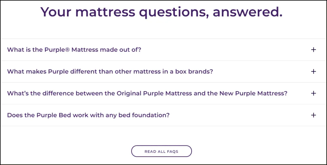
Source: https://purple.com/mattresses/purple-mattress
13. “You Might Also Like…” cross-sells:
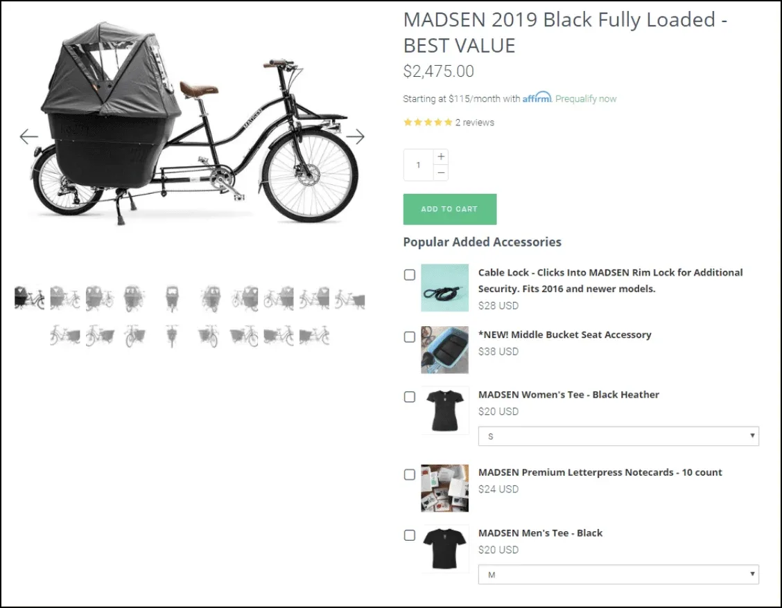
Source: https://www.madsencycles.com/collections/2017-madsen-bikes/products/copy-of-madsen-2017-green-fully-loaded-best-value
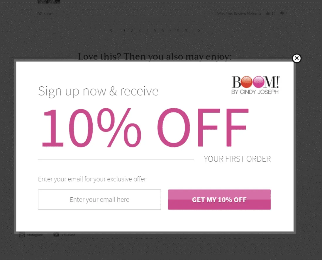
14. Exit-intent popups designed to save the sale or capture the visitor’s email address for later follow-up:
15. A fast-loading page, especially on mobile (try the Google page speed test to get an idea of your page speed):
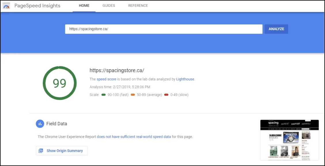
You can also use a “lazy loading” feature for your landing pages. Read more about lazy loading here.
16. Live chat:
Notice that a lot of these elements are simply repeating the same information but in a variety of formats. For example, you should communicate your USPs in your copy, your images, and your video.
The same thing goes for customer reviews. Ideally, you should have both written reviews and video reviews.
This is because different people prefer to consume media in different formats. Not everyone is going to go through your entire product page — some people will focus on the copy, others will fixate on the images, and others will pay attention to your product videos.
By communicating your most important sales content in all 3 of these mediums, you’re dramatically increasing the chances that everyone is going to consume it.
How to Implement All the Strategies from this Presentation
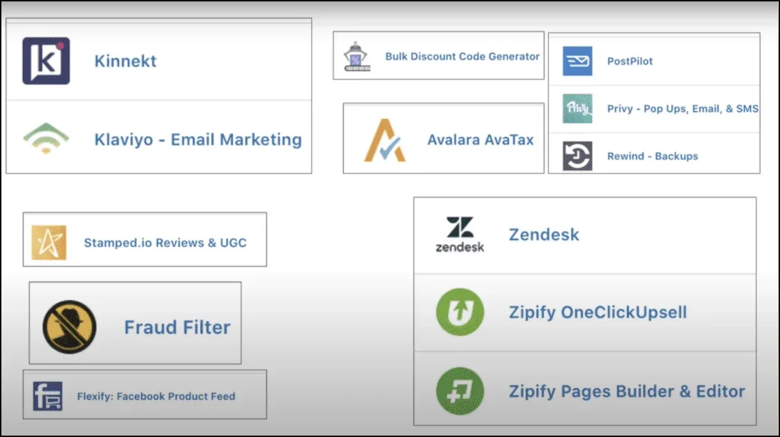
One of the great things about Shopify is their network of 3rd-party apps that allow you to layer on functionality to your store.
Here are the apps I’m using:
But if you want to implement the strategies I covered in this presentation…
Then the two most important apps are Zipify OneClickUpsell and Zipify Pages. I created both of them myself, and they both provide crucial functionality for any Shopify store looking to reach 8 figures.
Zipify OneClickUpsell
Pre-purchase / Post-purchase Upsells & Cross-sells
Offer upsells and cross-sells at every stage of your customers’ shopping experience — including pre-purchase upsells in the shopping cart and post-purchase upsells immediately after they buy.
On average, users increase sales 10–15% immediately after using this app.
Zipify Pages
Landing Page & Sales Funnel Builder
Copy the long-form sales pages and product mini-sites from this presentation, plus more proven templates from Ezra Firestone’s $100 million Shopify store.
This page builder also makes it easy to add all the conversion elements you need to professionally optimize your product pages.
That wraps up my 2-part presentation on what I learned from generating $100 million in sales for a single brand.
By combining the 12 big-picture strategies from Part 1 and the super specific optimization strategies of Part 2, I hope you can grow your business to 8 figures and beyond.
This was a lot of information, so try to tackle one thing at a time and go over both of these trainings again if needed.
Thanks — see you in the next one!