Hey, it’s Ezra! Thanks for joining me for a new Smart Marketer blog post.
Here at Smart Marketer, we’re all about helping you get more from your ecommerce store…
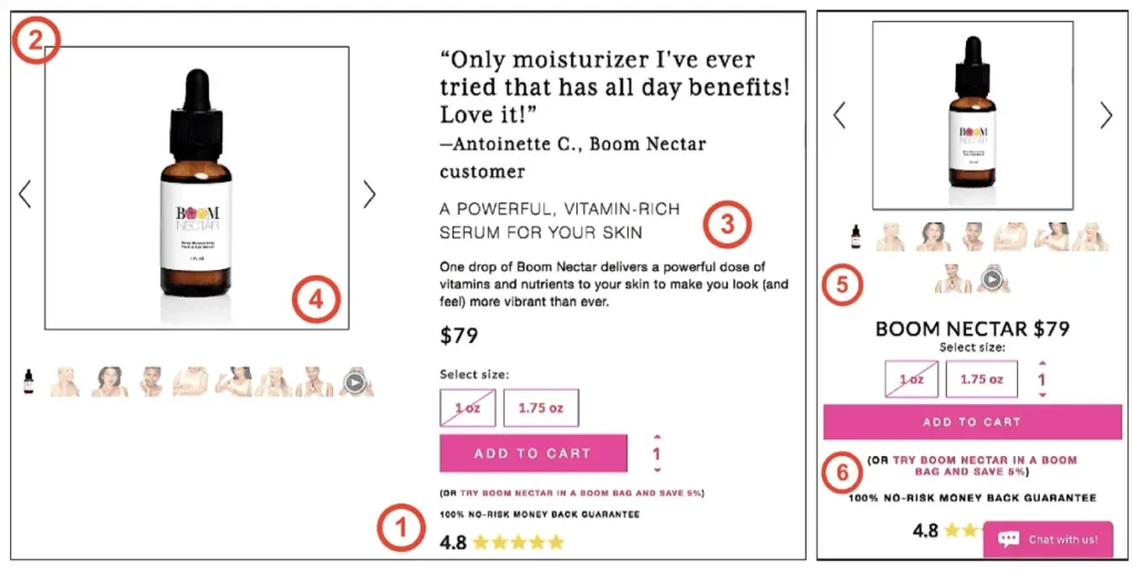
And for the last year, we’ve been focusing a lot on buy boxes. This is the section of your product pages, usually above the fold, that contains a pared-down pitch for your product — image, copy, variant selectors, etc. — along with a call to action.
It usually looks something like this:
Why have we been working so hard on such a small part of the website?
Well, the buy box is probably the most important section of your product pages, and your product pages are probably the most important pages on your site, so…
Buy boxes are pretty important!
Yet most ecommerce stores aren’t leveraging them correctly, often failing to include the right page elements or optimize this section for mobile.
So in this blog post, I’m going to show you how I improved the buy boxes on my $20 million/year Shopify store…
Including one small change that had a huge impact on revenue, and six more tweaks you should make to your buy boxes right now.
Can You Spot the Difference?
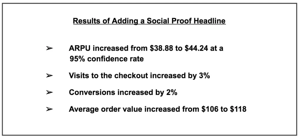
Recently, we made one small change to our buy boxes that produced a $5.50 increase in average revenue per user (ARPU), resulting in an extra $30,000 a month for just one of my products.
Think you can guess what that change was?
Look at these product page buy boxes and see if you can spot something that stands out from a traditional ecommerce buy box:
I’ll give you a hint: It’s somewhere near the top…
Okay, time’s up. Here’s the answer… Instead of starting the buy box with the product name in the title (like every other ecommerce store in the world)…
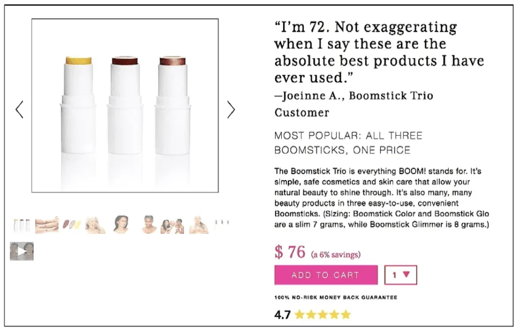
We open with a social proof headline:
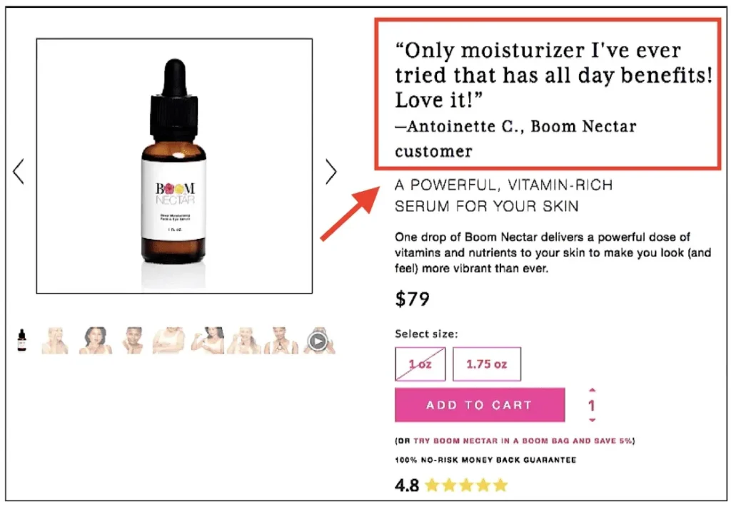
POW! Right when you land on the page, there’s a glowing customer review right at the top of the buy box.
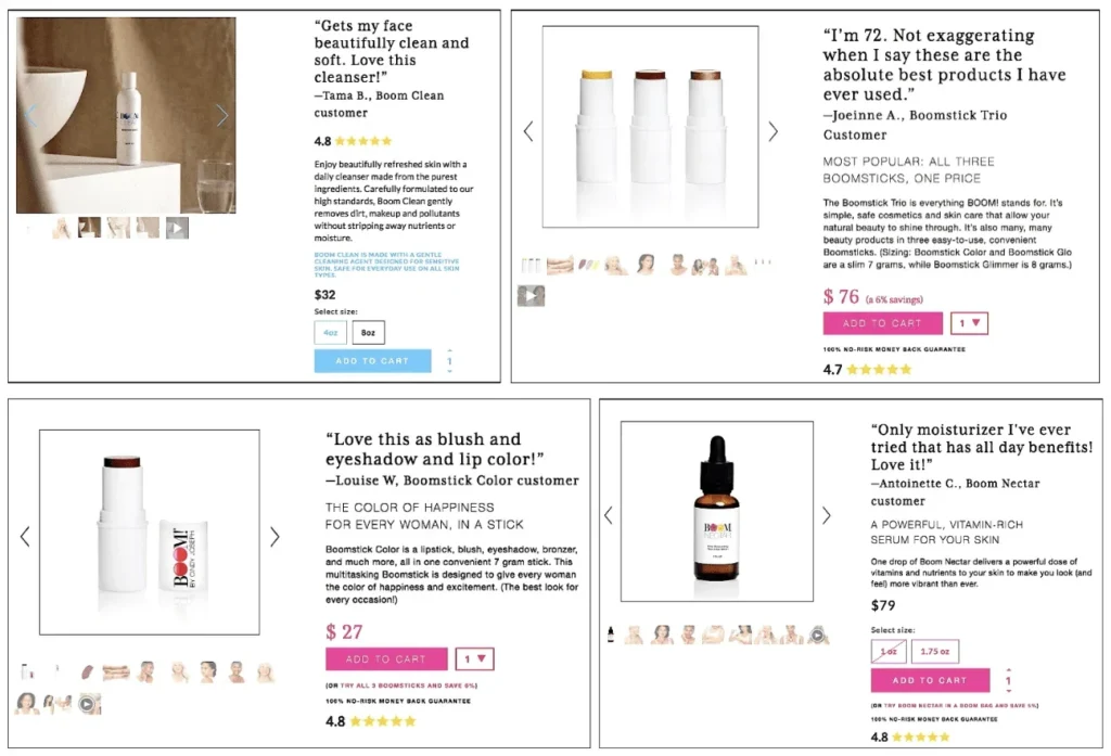
We’ve been testing this strategy across all our product pages, with incredible results:
The results were incredible, but not surprising. When someone lands on your product offer page, they don’t want to hear that you think your product is great — of course you think it’s great, it’s your product…
They want to hear what people like them think about it. That’s why including social proof at the top of the page is so powerful.
This is just one of the cool things we’ve tested on our buy boxes lately that’s working really well.
Here are 6 more tweaks we’ve made that have produced significant gains, plus instructions for how you can implement them on your Shopify product pages.
More Improvements for Your Buy Boxes
Because we get so much traffic on our store, we are able to test a lot of different ideas to improve our buy boxes.
Here are 6 things we tested recently that have produced big results.
1. Star Rating – We include social proof review stars either at the top or bottom of the buy box. While this is pretty standard ecommerce strategy, we like to verify everything with actual results. When we tested it, we found that ARPU increased from $16.53 to $17.99 and conversions went up by 2.45%.
2. Image Borders – You always want to have borders around your images, especially if you’re using images with same background color as the rest of the page.
3. Product Copy – It’s surprising that I have to say this, but… You want to include a little bit of copy in your buy box! More and more lately, I’m seeing pages that don’t include any copy, forgoing the opportunity to pitch the product and express the voice of the brand.
4. Optimized Images – You want to make sure that your images are optimized so they show up correctly on different screen sizes and don’t hurt your page-load speed. (The app I created to build all my product pages is called Zipify Pages and it optimizes your images automatically, both for page-load speed and different formats.)
5. Mobile Carousels – Images sell, and the more the better! That’s why we’ve found it effective to have an image carousel on desktop and mobile that includes thumbnails for each image (instead of small dots that imply more images). This mobile carousel increased engagement with our images, which in turn increased overall conversions on these pages.
6. Mobile CTAs – On mobile, you want your add-to-cart button to span the full width of the page so it’s easy to tap. (Medium-width CTAs are okay on desktop.)
Optimize Your Buy Boxes with Zipify Pages
These are simple customizations you can make to your buy boxes to improve user experience on your pages and increase revenue on your store.
If you want an easy way to implement the same buy boxes I included in this post…
Plus get access to all the top page templates I use on my $20 million/year ecommerce store…
Check out Zipify Pages, my sales funnel and landing page builder for Shopify. This app makes it cheap and easy to grow your store by leveraging high-converting, ecommerce-specific pages in your marketing.
Watch the video above to see Zipify Pages in action.
Thanks for checking out this blog post. See you next time!
Click Here For Video Transcript
We’ve been testing this across all of our products and what we found are crazy incredible results and only makes sense. Someone lands on your product offer page, they’re checking out your Buy Box. And what they see first is someone else besides you because of course, you think you’re awesome, telling them why this is a good product, social proof to open the Buy Box. In this case, particularly for this Boom! Clean product here are the test results, average revenue per user increased from $38.88 to $44.24 at a 95% confidence rate. With an aggregate increase from 53,500 to 63,256 over the course of the month when we ran this test. In short, that means that we stand to make slightly more than $30,000 per month, as a result of having the testimonial as a headline on this product. Visits to the checkout were up by 3%, you know, conversions were up by 2% but our real gains were an average order value, which increased from $1.06 to $1.18 at a 95% confidence rate.
Now, in addition, I wanna show you some other cool things that we’re doing in our Buy Boxes that are working really well. Number one is we always include the social proof review stars at the top or bottom of our Buy Box. And by adding these social proof review stars to the Buy Box, this is pretty standard straightforward e-commerce but we tested it just because we like to verify everything with results. And what we found was that average revenue per user increase from $16.53 to $17.99 at a 95% confidence rate and also conversions were up by 2.45% as well at a 70% confidence rate.
Now, let’s talk about some other things in the Buy Box. You always want to have borders around your images, we found that to work, you want to have a little bit of Buy Box copy. On mobile, you want to have a Add to Cart button that spans the width of the page, have your buttons span the width on mobile, so they’re easy to tap on. We’ve also found that again, borders around images, easy way to scroll through the carousel, and give people a visual on mobile of what those images are gonna look like. But don’t just put the little circle dots actually show the little icons, little thumbnails on mobile as well because you get more engagement with your product carousel. I wanna show you something cool. When someone is engaging with your product offer page, they’re going to engage with that carousel. That is how you sell a product with e-commerce is you show off imagery of it and you’ve got to do that well. Couple things to note about this, we have found, you know, in every case that more pictures is better and that showing the thumbnail icon on mobile is better. And you wanna do what we do for you in Zipify Pages.
So, I have this really cool tool called Zipify Pages that helps you build out these Buy Boxes where you can, you know, upload, you know, images into your carousel, and you can add videos and you can rearrange them. But one of the really fun things that we do in here, I’ll just add a couple in so I can show you I’ll save that, actually when you’re editing your Buy Box, you can actually decide what elements you wanna show, whether you wanna show the carousel, the product name, the review stars, right? You can turn those on, turn those off, you can see what it’s gonna look like on mobile, you can see what it’s gonna look like on desktop. But what you want to do is make sure that your images are optimized. So, when you upload an image to our landing page editor for Shopify called Zipify Pages, you upload an image file on the backend. We actually optimize that into a bunch of different formats so that in this case, like if you’re serving this up on a mobile device like this, right? If you’re gonna serve this on a mobile device, we’re gonna show a different version of that image and if you’re gonna serve it on a tablet versus if you’re gonna serve it on a desktop device. You know, we’ve got this nice little countdown timer in here for you, you got a bunch of options where you can manipulate your Buy Boxes, choose your product that you want in your Shopify store, this is just a test store here. It’ll dynamically pull in your Shopify product, you can set a discount for it if you want, which will show up in your Buy Box, which is pretty sweet, you can see here. Save that and that’s gonna show up, you have to put in the product description because it’ll pull it in automatically, this product I just pulled in doesn’t have one.
But the point that I’m making is whether or not you’re using my tool, which is Zipify Pages to make your Buy Boxes and make them work or you’re using your own tool, you wanna do things like this where you come in and you say, “You know what? I wanna border around these images, I want it to be black, or pink,” you know, whatever your brands is, “I want it to be, you know, 3 pixels.” You don’t…definitely don’t want it to be 33 pixels. You know, “I want it to be 3 pixels, I want it to show up on mobile and desktop, you know, I want this button, I want this button to be full width. I don’t want it to be medium width.” I mean medium width is okay on desktop, right? Like that. And if you’re going to do that, you probably want to left align that button so it’s aligned with the content that is in your Buy Box, which again, what are we gonna put right here? Well, if you’re like me, you’re definitely gonna open that Buy Box with a customer testimonial. So, I’m gonna open up the Buy Box content, I’m gonna go ahead and say, “You know what? I want this to be 18 pixels, I want it to be 700 weight.” And I’m gonna save that and I’m going to have that as the first thing that you see when you land on there.
But the point that I’m making is there is some really simple customizations you can make to your Buy Box to make them more functional. Multiple products in your carousel, borders around your images, social proof to open it, a little bit of copy. And I go really deep on the Zipify blog, and in the trainings on zipify.com website where I talk a lot more about Buy Box. Just want to share a couple with you, the most important being open with social proof.
Hey, you know, if you’re interested and you’re on Shopify, there is no better landing page builder than Zipify Pages to help you build out Buy Boxes, product offer pages, presale articles, do things like you know, have sticky headers where on desktop that header is going to be stuck to the top so that there’s a call to action available anywhere in the page. It does a lot of really cool stuff, please check it out, go to zipifypages.com or just take these tips and implement them in your business. My name is Ezra from Zipify, thanks for watching. Catch with you the next one.