Want to make more money from mobile traffic?
Ezra here, and In this post I’m going to help you copy the two small changes I made to my online store that more than doubled my mobile conversion rate, increased email subscribers by 22% and greatly improved the shopping experience for my customers.
And the nice thing is, you don’t need to change anything about your actual sales pages or the content of your store…
All you need to do to get results is update the header on your store.
(And if you’re already a Zipify Pages user, all you need to do is click a few buttons to enable these features.)
Let’s start with the changes I made to the mobile header of my store.
Mobile Header “Phase 1”
In August 2017, this is the layout I was using for my store’s mobile header:
 It’s not a very good one, and here’s why:
- There’s a huge logo at the top that takes up too much space
- The phone number is front and center (again, taking up space)
- And see that big grey bar? It’s doesn’t do anything!
During the time I was using this header, 52% of my total traffic was viewing my website on a smartphone and 25% was viewing it on tablet.
So essentially, 77% of everyone interacting with my brand was forced to engage with this header, and that traffic represented millions of dollars in Facebook ad spend.
Here Was the Problem…
My mobile conversion rate was down (way down) compared to desktop, and my per session value on mobile wasn’t good either:
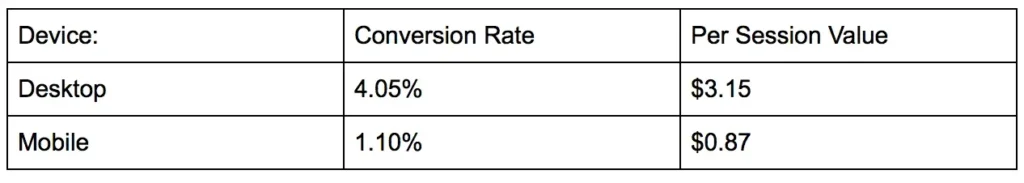 I needed to get these numbers up, so I started toying with our mobile header.
The reason I focused on the mobile navigation and not, say, our sales copy, is because anyone who engages with my store on mobile must engage with this header first.
So, I made some simple design improvements, added a few buttons, and this is what it ended up looking like:
 The first thing you see is that the new header takes up a lot more screen real estate, but there’s also a lot more action they can take.
(This is not the final version, by the way, but it was a major improvement.)
I also added a “back to top” button to our mobile pages that appeared whenever the user started scrolling back up, automatically returning them to the top of the page. Similarly, the header menu and icons automatically dropped down whenever you started scrolling back to the top of the page.
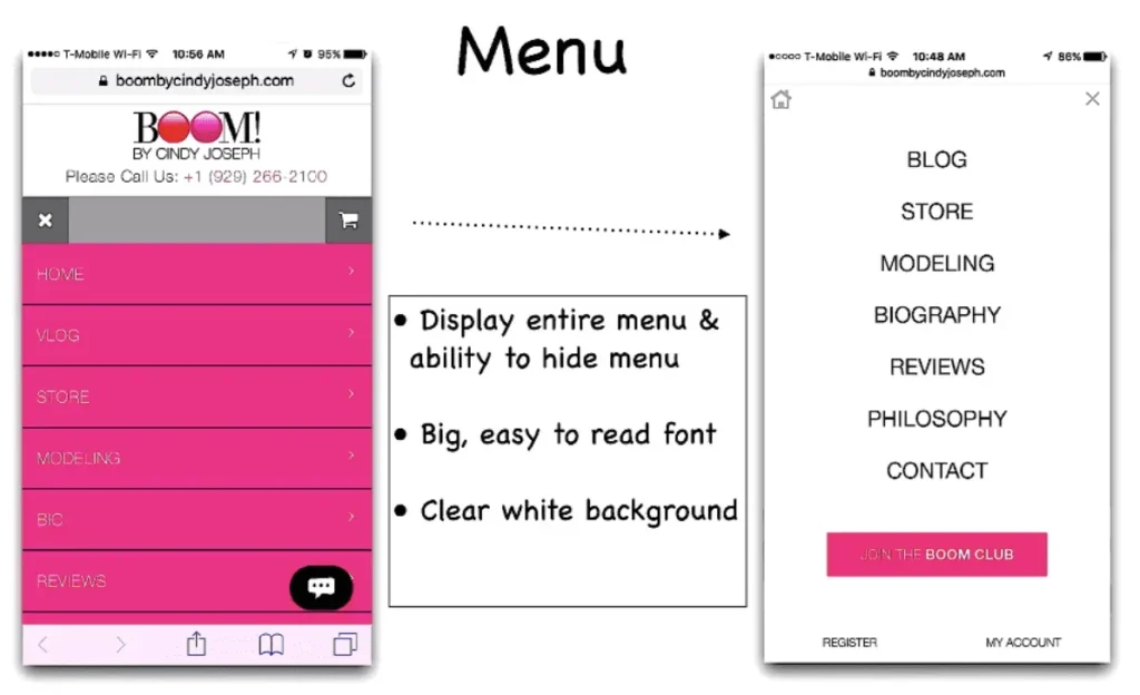
And finally, I redesigned our fly-out menu to be easier to read:
 After making these improvements to our mobile header, the change in conversion rate from August 2017 to April 2018 was very significant:
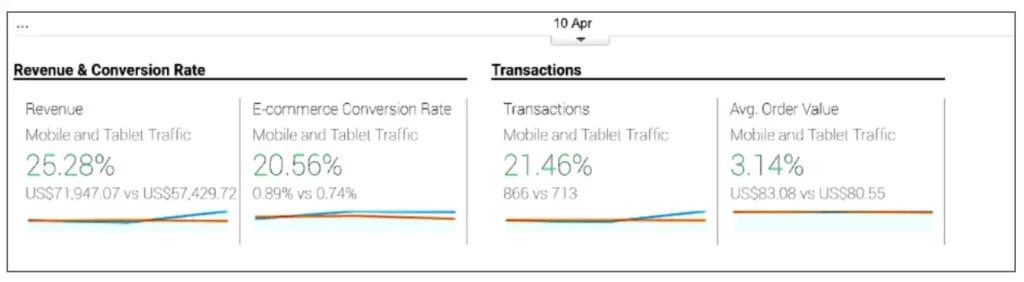 Mobile revenue shot up 25%, mobile conversion rate went up 20%, and the number of transactions increased 21%.
(This is all from cold traffic, by the way!)
A 20% increase in conversions means a 20% increase in total sales from mobile traffic on our store, just by improving the shopping experience on a mobile device. That’s a huge win for any business.
Here are some other exciting results from this change:
- Average revenue per user increased from $6.87 to $7.25.
- Average order value jumped from $65.84 to $70.34.
Now I’ll show you what I’ve done to this header since April 2018 to get these numbers even higher and increase visits to our product pages.
Mobile Header “Phase 2”
Once we saw these initial results from optimizing our mobile experience, we went all in.
We scaled down our header to adhere to what I call the 15% Height Rule, taking up less real estate above the fold.
To show you what I mean, here’s our header from Phase 1 on the left (look how much space it takes up at the top!), versus our new header from Phase 2 on the right:
 By following the 15% Height Rule, I have more space to show off the products without losing any functionality.
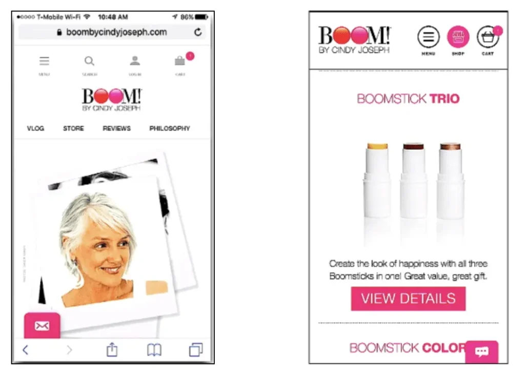
I also added a “Shop” icon:
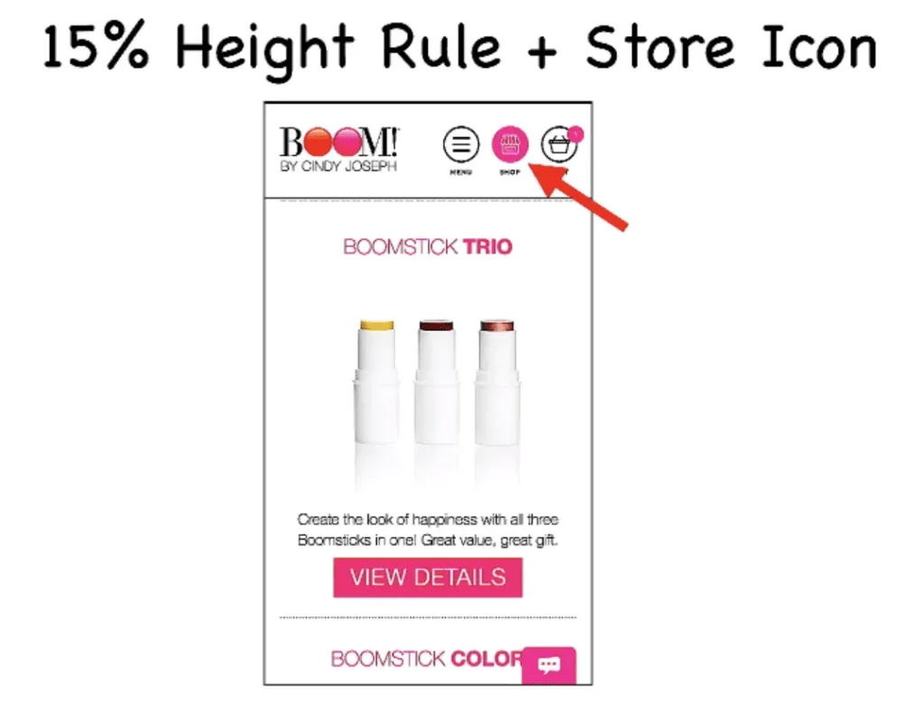 And want to hear something crazy? This “Shop” icon is a game-changer! This one little tweak increased visits to our store page by 86%…
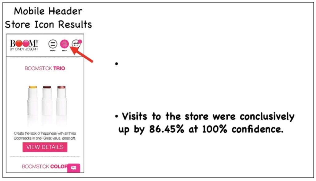 86% more people shopped our products because of one icon. That’s incredible.
My biggest goal for cold traffic is to get them to view my products, so with 86% more product views, just think about the impact that can have on your business.
Changes to the Fly-out Menu
Another update we made to our mobile header was to make the fly-out menu even easier to read and exit out of:
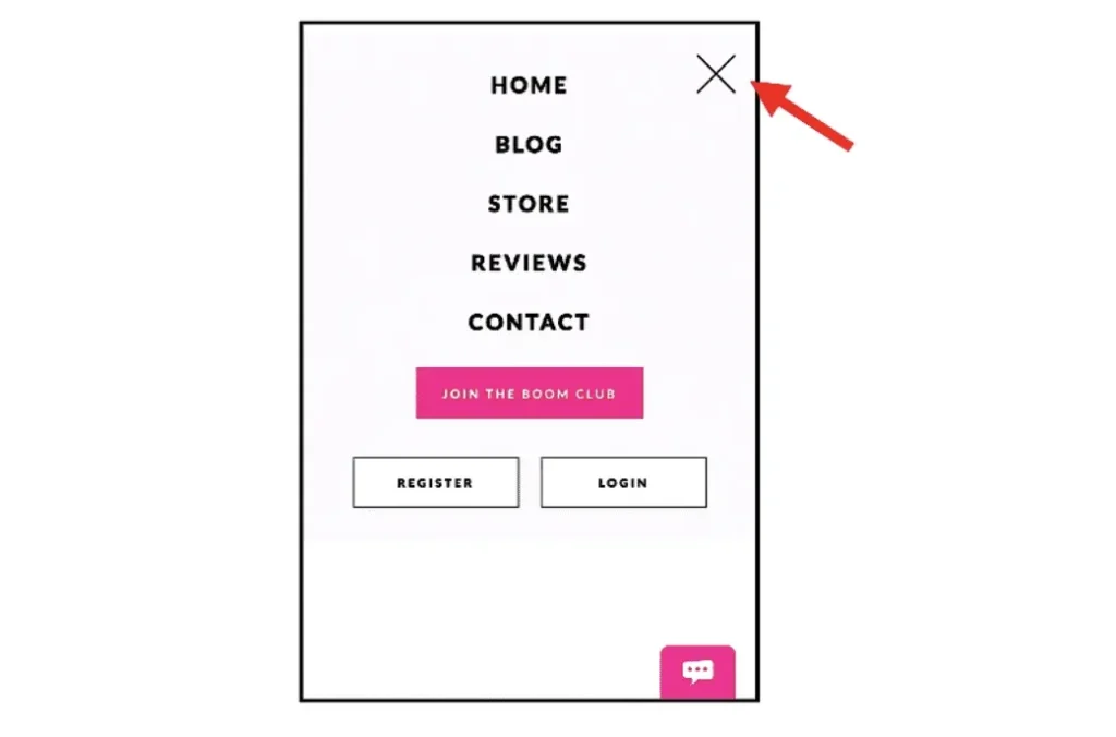 The text is bigger, and that big “X” means users can quickly flip between your mobile navigation and your actual store pages.
Plus, simplifying the menu means it’s one less point of friction for your customers that might otherwise harm their mobile shopping experience.
Final Results: Oct. 2018 to Feb. 2019
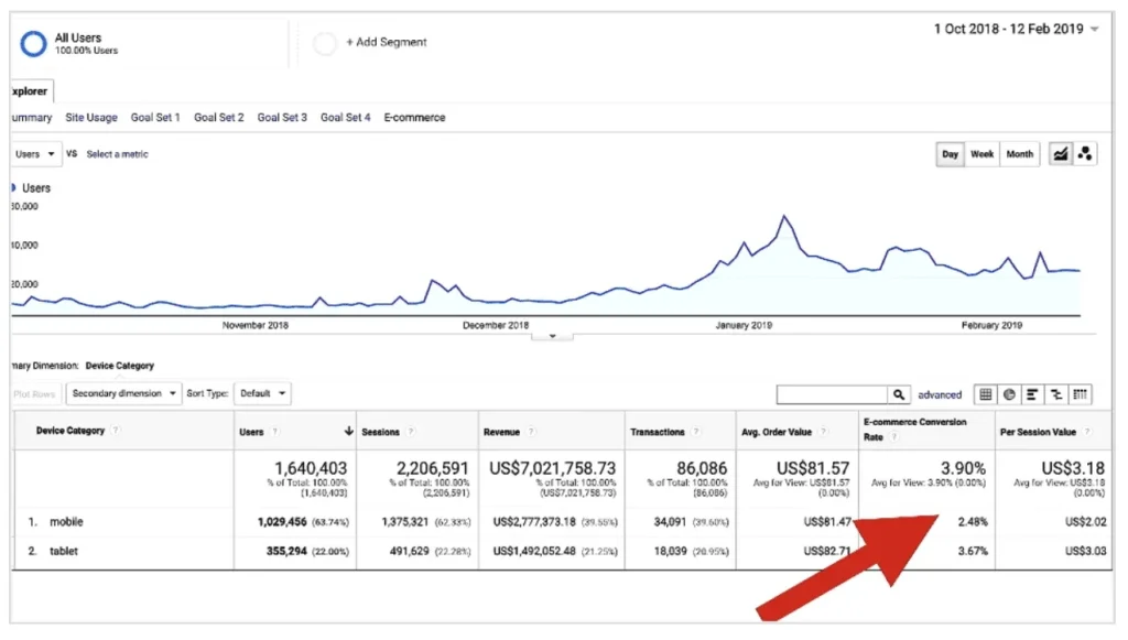 Since August of 2017 our mobile conversion has more than doubled from 1.1% up to 2.48%, and up to 3.67% on tablet.
Converting more of your mobile traffic is one of the biggest sales opportunities you have right now in your business, but it’s also one of the areas most stores struggle with.
To help you take what you learned in this post and instantly copy it for your store, I’ve added all of these new features to Zipify Pages, my landing page and sales funnel builder for Shopify.
Check out the 6:00 minute mark of this video to see how easy it is to use.
Optimizing for Desktop Traffic: How I Increased Email Sign-ups by 22%
Next, I’m going to tell you about a test I ran on my store that gave us a massive boost in email subscribers.
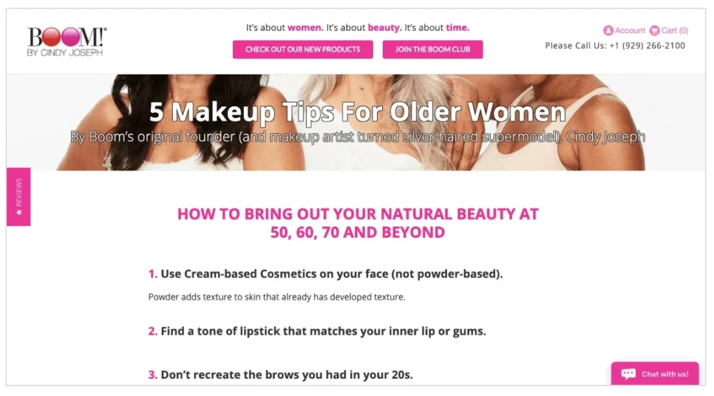
We drive a lot of cold traffic / awareness traffic to article pages, and in particular, an article called “5 Makeup Tips for Older Women”.
This is called a pre-sell engagement article because it engages new visitors in a conversation about a problem then introduces our product as the solution. On this page, we only have two goals:
- Get subscribers to our email list so we can communicate with them later
- Get people to check out our products
That’s it. Those are the only two things we want these people to do, and that’s why we created a “double header” for this page:
 This is actually a “sticky” header, which means it sticks to the top of the page even as they scroll down, so those two calls to action are always visible.
Since we started testing this two years ago, this style of header has become very popular among ecommerce brands. Let me show you why.
With this small change to our header, I was able to:
- Increase our value per visitor from $1.47 to $1.67
- Increase clicks to Join Our Club by 20%
- Increase email opt-ins by 22%
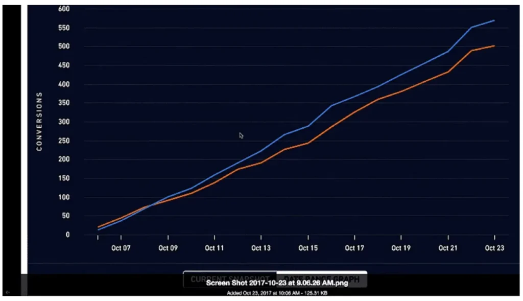
And unlike most split tests I’ve run, this sticky header never lost to the traditional desktop header it ran against, not even for one day. It was winning the entire time:
 Since then, I’ve tested the sticky header concept all across my store: on product offer pages, holiday sales pages, email landing pages… and it continues to perform extremely well.
This sticky header is now built into Zipify Pages, so no matter what call to action you want in your header, you can pin it to the top of the page with the click of a button.
Desktop Traffic Is Still 50% of Revenue
For your business it’s very likely that only 15 – 20% of your traffic is viewing your store on a laptop. However, that 15% of traffic will be worth half your revenue.
Because as prevalent as mobile is, a big percentage of your customers are still going to switch to a desktop or laptop to make a purchase decision. They might see your ad or visit your store on an iPhone, but very likely they’ll switch to a larger device before they convert.
So even though it’s a small percentage of your overall traffic, it’s worth a lot and it’s worth optimizing.
See More at ZipifyPages.com
I love engaging with this community of entrepreneurs and online business owners who are creating great products and sharing them with the world.
And it’s my opinion that if you’re going to spend the money and energy to do all this…
It’s worth it to optimize your sales process to get the highest possible ROI, deliver the best shopping experience to your customers, and continue to grow your business.
Both the mobile and desktop headers I featured in this article are included in Zipify Pages, my landing page and sales funnel builder for Shopify.
Learn more about Zipify Pages at ZipifyPages.com.
Click Here For Video Transcript
So, we looked to our top navigation to fix this because that’s where people are engaging with. If they’re gonna engage on mobile, they’re gonna engage that top navigation so we added some things. We added a more functional header labeled buttons, a search option, and really important pages bookmarked. This is what it ended up looking like. You can see it takes up a lot of screen real estate, but there’s a lot more action for them. And this is not the final version, I’m gonna show you the final version in a minute. But just doing this was a big improvement. You’re gonna see how big here in a second. And so we also added this thing where when someone scrolled down, we wanted to give them a quick way to get back to the top so that they could just click this little button that appears and scroll right back up to the top without having to scroll, scroll, scroll. They can just tap one thing and get back to the top of the page. And along that same line of thinking, this bar drops down for them as soon as they begin to scroll up and you’re gonna see a video of this in a second. And then finally, this is what happened when you would click our menu, it was like super funky, you couldn’t see the text links, it was hard to engage with and we changed that to be way more easy to deal with where it’s like the lettering was much bigger, much cleaner, the menu flew out better, there was a way to exit out.
Again, this is not the final version, but just moving to this, just displaying the entire menu and having an ability to hide it, making big easy to read font, having a clear white background, all of this stuff resulted in a significant improvement to conversion rate. I’m gonna show you how you can do this using my application in a minute but look at this. This is just cold traffic, by the way. 25% increase in revenue from mobile and a 20% increase in conversion rate from cold awareness traffic to mobile, 20% more revenue from mobile visitors from those simple changes. So, I wanna read some of the actual results from this test. So, average revenue per user increased from $6.87 to $7.25 and 80% confidence rate. So, wasn’t a full winner because only at 80% average order value went up by nearly $5. But all that stuff is not a high enough confidence rate in the test to really call it. Here’s the point where this thing really wins is visits to the store, we’re up conclusively by 86.4% at a 100% confidence rate on mobile. 86% more people visiting the store on mobile, 100% of the time. That is incredible for e-commerce. So, you must have a store icon in your mobile header. If you’re running an e-commerce store for sure, do that. So, you can see how it functions here. It’s pretty big when you first land on the page. As soon as you scroll down a little button appears for you to be able to tap and get right back up to the top of the page. If you begin to scroll down and you show upward intent, we drop that menu down for you. Then when you click fly out it flies out nice and easy, big easy to read text and X to close it off. Super simple, but makes the menu on mobile significantly easier to engage with.
Now, we’ve made some big improvements even since then. Just this, just what you’re looking at here, this functionality was worth 20% increase in conversion rate. And by the way, if you don’t quite understand the value of 20%, 20% more revenue. Right? So, basically, what that means is that when someone comes to your page, they’re 20% more likely to buy from you just from making it more usable, more functional on mobile devices. Now, I wanna show you what we’ve done since then because once we saw the incredible amount of improvement that we got from optimizing our mobile experience, we’ve been all in on this. So, check out where we are now. Now, what we’ve done is we’ve adhered to what I call the 15% height rule. And what that means is our header only takes up at a maximum, 15% of the height of the actual screen real estate. And you can see in our first version here, go back here and we look at this one over here on the right. Look at how much height that takes up. That’s got to be 35% of our screen real estate was taken up by the header and even with that, even with 35% of the overall screen real estate being taken up by the header, it still outperformed the non-functional version we had before. But now we’ve adhered to this 15% height rule where that gives us much more real estate to show off our page and we still have a super functional header and we increase our conversion rate even more and we added this shop icon here. And 86% more people visit our products since we’ve had this shop icon on mobile. And you know the goal with e-commerce is get people to visit your products and then get them to add them to the cart.
So, we’re using our header to have an icon call to action to go to the store which increased the number of people visiting our store by 86%, which is significant which results in more people seeing products and more people converting. Now, I’m gonna show you how you can achieve this if you don’t have a designer and a developer. But right after I do, I’m gonna talk to you about a really cool test that we ran on desktop because desktop is completely different from Mobile. You need a completely different user and web experience for someone visiting on a laptop or a desktop then do on a mobile device. We did a really cool test for the header of our website on desktop, specifically for awareness traffic for people who’ve never seen us before that increased our performance greatly that I’m about to show you. But first, let me show you. You can achieve these results on mobile if you don’t have a designer or a developer. Let me show you.
So, I built this tool called Zipify Pages that’s for Shopify stores and allows you to very easily drag and drop design pages and we just added this functionality for a header. We’re on the mobile layout. You can decide what icons you want to show like let’s say you want the shop icon. You can see it shows up, up there. But you see this functionality right here appears on scroll up. So, basically, if you select that and you click save and then you view the mobile version of the page and you begin to scroll down, as soon as you scroll back up, it appears. See that? It drops down for you on user intent and that functionality increases engagement with your header significantly. You either add to that having this store icon here on mobile as well, go to the mobile layout, and you enable the shop icon which will link to your store or link to wherever you want. You can set where it links to. It’s very, very powerful. And one final thing that we’ve landed on our mobile menu is we’ve made our fly out menu even easier to engage with. So, you’ll notice that we’ve added a big giant X here on the top right corner, we’ve made that text even bigger. And take a look at our value per visitor now. So, you can see here this is the last couple of months, October of 2018 through the day I’m shooting this video which is February of 2019. You can see that our conversion rate for mobile is up to 2.48%. Before it was sub 1%.
So, this isn’t the only change that we’ve made, but this header change was responsible for a huge part of that jump in conversion rate on mobile because mobile is where a lot of your traffic is coming from. You wanna convert as highly as you can and if someone’s uninterested in the page that they’re on, the header is where they’re gonna engage and if it’s not easy to engage with slash useful and functional, they’re gone. So, focus on your mobile header. All right. Now, I wanna quickly… I know this is a long video, I apologize. I’m excited about these conversion rate optimization best practices because it’s like, man, if you’re gonna spend money to buy advertising to your business, you might as well optimize your sales process so that when people are engaging with your pages because look, your business is simply a collection of pages that people engage with and either decide to do business with you or not. So, when people are engaging with your pages, you wanna make it as easy for them as possible to access the correct information to help them make a decision as to whether or not they wanna do business with you. And this test that I’m about to show you was for desktop only, traffics only, people visiting on desktop and laptop and for only awareness, only new people who are coming into the mix and seeing who we are and that we’re driving traffic to our… we drive traffic to article pages from the most part for new visitors. Let me show you this page. I’m gonna ask you if you can figure out what we did here. So, check this out.
So, this is the page that we drive a lot of traffic too. It’s a pre-sale engagement articles, an article that engages you in a conversation and then alludes to a solution, tells you about our products. And what you’ll notice is that as you’re scrolling, the header element is stuck. It’s called a sticky header. Right? Where those call to actions are available for you as you’re consuming the content on the page. And this is now really, really popular in e-commerce since we’ve been testing it for the last couple of years. And let me show you the actual split test results here. So, this is the heat map here for the test and what I wanna show you is actually the results. So, what you can see here is that average revenue per user was up from $1.47 to $1.67 at 93% confidence. And people who are joining our boom club because one of the things that you’ll see is we don’t just have a call to action for visit our store, check out our products. We have a call to action to enter our email list. Join our club, get on the email list. And the reason for that is we have two goals in e-commerce. Subscribe to us so we can communicate with you later. Best of kind of subscription that there is hands down is an email address subscription, not a Facebook like, not a YouTube subscriber, not an Instagram subscriber, email address or check out our products. That’s it. Those are two things that we’re trying to get you to do.
So, you can see both of those are in the sticky header. And when we look at the results here we can see that clicks to join the club were up by 20% and joins were up by 22%. And what you can see here from this chart is that a lot of times with split testing it goes up and down up and down up and down. Here, the sticky header won the whole time. It never lost this test as you can see from our test graph here and we’ve since tested the sticky header concept on our product offer pages, on our product sales pages, on our holiday sales page, on our email any page. We are now in love with sticky headers because they work so well because they keep that call to action stuck at the top of the page. Add that product to this cart, join our email list. And so we went ahead and built this functionality into our landing page builder for Shopify stores called Zipify Pages and so now no matter what element you have here, you can click the sticky button and then basically what that will do is that will stick that to the top of the page. So, doesn’t matter if you’re using this header element or maybe you’re going for the header element that has both calls to action in it and you’re in here and you’re putting your logo up here and maybe you’re changing out these links or maybe you want it so that you want the color to be a little different so it matches your brand and you want it that when someone scrolls over that link, it animates it, it highlights, you wanna set the destination to that to visit a particular product of yours or whatever, but you can set that to sticky and then when someone’s viewing it on desktop or tablet, it’s gonna be stuck to the top of the page. And obviously, on tablet you would probably make your tagline a little smaller.
But anyways, the sticky header element is a really, really powerful element for conversion. For you, for your business, it’s very likely that 20% of your traffic will be desktop and laptop or maybe even 15, but that 15% of traffic will be worth half your revenue because desktop and laptop is where people buy. People start their purchase decision, they see your ad, they see your video on their mobile phone on Instagram while they’re sitting on the John, or they’re using their phone and then they save it and you retarget them, they save it and they come back on desktop and laptop when they’re gonna buy or you retarget them and make that purchase on desktop and laptop. So, even though they’re a small percentage of your traffic, it’s worth a lot. So, you really wanna optimize it and one of the ways to do that since you have so much screen real estate is to stick those call to actions right at the top of the page. You can do this in my landing page builder called Zipify Pages at zipifypages.com if you’re on Shopify if not, use this, please. It’s gonna help you. My name is Ezra Firestone. Thanks for taking the time to watch these videos. I love this stuff and I really love engaging with a community of e-commerce, business owners, online entrepreneurs who are also into conversion rate optimization because I feel like if we’re gonna do the work to, build the business, to create great products, to drive traffic, we should do the work to create a sales experience that is the most easy to engage with for our prospects. It’s better for us, it’s better for them. So, thanks for watching. I’ll see in the next one. Bye.