Let’s play a quick game of…
Which of these Facebook ads got absolutely CRUSHED?
But you can’t really make an informed guess without asking some questions, like…
A) Who the heck was the audience?
B) When in their customer journey did they even see this?
Because someone who’s been to my site or even purchased from me before is going to respond a lot differently than someone who’s just beginning to learn what my brand’s about.
Hint: Who, When & Why
These three ads were shown to folks after they visited my website and added a product to the cart, but then abandoned it and didn’t buy.
That means they:
A) Have already engaged with our brand story and our awareness ads
B) Are familiar with the design and branding of our website and products
C) Shopped our product catalogue, visited our product pages and even selected their favorite products
Okay, so now that we have some context, which of these three ads do you think performed the best…
And which ad got squashed so bad, you’d think it came in last place at the 2017 Squash World Championships?
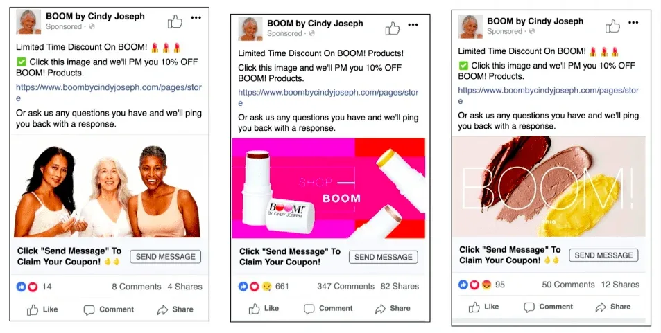
And the Winner Is…
The ad with the three women smiling and holding a product you probably didn’t even notice, that ad was the big ol’ loser.
So scratch that one from the game — it’s dead to us now.
As for the other two: The ad on the far right was outperformed by 50% at $8 per conversion vs. $12 by the winning ad in the middle.
Fun game, right? But what about the most important question of all…
Why Did the Winner Win and the Losers Lose?
For that I got a little help from my friends Molly Pittman, Lindsay Marder and Colleen Taylor.
Together the four of us analyzed these three ads to determine what variable(s) made the winning ad so much more successful.
Let’s start with the variables that stayed the same for every ad.
The 10% discount was the same. The call to action buttons were the same. The button text was the same…
And aside from the emojis which were removed on the winning ad — the post copy on the actual Facebook post was the same.
Now I know what you’re thinking: Could it be that removing emojis is exactly what caused the 50% increase? Maybe…
But I doubt it.
While emojis have definitely improved performance on our ad campaigns in the past, they’ve never had this huge of an impact before. That’s why the four of us agreed that this lift was due to the ad’s image.
Molly Weighs In on the Winner:
“In my opinion it has nothing to do with the emojis, it’s really that image.
We’re offering a discount in all three, but the product they just looked at (or a similar product) is right there…
The one on the right is cool, but the one in the middle really has the same colors, it’s got the branding from the site, so there’s just familiarity there.”
Same colors, same branding and hero shot of the product, I think Molly’s analysis is spot on.
Let’s think about it…
The Winning & Losing Elements
Just for someone to make it to my website from Facebook — let alone go shopping and choose which product they want — that person has already seen a lot of content from me.
Probably they saw a story-based awareness video that was 2 – 6 minutes long, then clicked over to a presell article about our founder (plus 5 makeup tips), and then started shopping.
That means I’ve educated them not just on our brand story but also our mission, visual aesthetic/design and also what differentiates us from other cosmetic brands.
Now go look at the ad on the left. After all this, are you surprised that people didn’t identify with three women who are not the founder and who are holding a product you probably can’t even see?
The image doesn’t contain any of the most recognizable elements they’ve seen so far.
As for the ad on the right (which is the actual cosmetic by the way), it may look more appealing to Molly and me, but it wasn’t in any of the content they saw in their journey to the cart:
No hero shot of the product, colors that vary from the website, and frankly branding that’s a little “too cool” to match the rest.
So even though it performed better than the loser, this image still wasn’t inciting their desire to buy as well as it could have.
Because at this point in their journey — once they start adding products to their cart — they aren’t shopping for story or ingredients anymore…
They’re shopping for actual products, so it makes sense that the ad that highlights the product image will resonate and will (probably) win.
And win it did, at about $4 less per conversion.
Want to Play for Double or Nothing?
If you liked this game and want to try your luck again with variations of my store’s emails…
Watch the full video above for Round 2 of what I’m now calling “What the Heck Was I Thinking?”
But hey, remember that advertising is all about testing new ideas, and discovering the losers is an important part of the process.
You can also watch our incredibly detailed review of the advertising, email marketing and website of Allbirds shoes during this same Facebook Live.
Highlights:
1:50 The ad on the left performed half as well as the other two
3:19 The ad in the middle out performed the ad on the right by 30%
3:40 The image in the middle ad is more compelling and has the same branding as the site
5:34 We ran a split test for a blue vs a pink CTA in emails
6:39 The pink CTA out performed the blue CTA
10:13 In 2018, branding and design is a no brainer
Click Here For Video Transcript
Colleen: In looking at these screenshots, I’m going to say the middle one because of all that…all that social proof.
Ezra: Okay, Colleen is saying number two. What have we got here?
Molly: I’d say number two. It had a longer life.
Ezra: Okay, number two. Someone’s saying number one?
Lindsay: I agree. Number two.
Ezra: Okay, everyone here is saying number two. Rob says number one. Dennis says number two. Christopher says number three. Okay. So what I will tell you first is that, number one, all the way on the left with the three women, got absolutely annihilated, meaning it performed half as well as these other two.
Molly: There’s no branding on it, and if they just left your cart, they’re familiar with BOOM!.
Ezra: Right, they’re familiar with the product. What Molly just pointed out is, looking at these three different ads, someone who’s at this particular stage of the purchase journey, who had a product in their cart and left, is not going to identify with three random women, even though if you look close, they are holding the product. Pop back to that. If you look close, they are holding the product, but you can’t see it, whereas on the other two ads that performed pretty equally, except for one did maybe 30% better, so not pretty equally, but they performed significantly better than the other one. I think it’s because the hero shots of the product is [inaudible 00:.02.35].
Molly: Absolutely, and they say BOOM!.
Ezra: They say BOOM!. They say…all right. So the lower third, and the hero shot. We can get rid of the one all the way to the left. That did not work. And Sophie has joined the party, ladies and gentlemen.
Together: Yeah.
Ezra: Hey girl. Sophie has joined.
Colleen: She’s like, “Where are my old birds?”
Ezra: I’ve got Sophie here, she’s part of…
Molly: Sophie’s an angel.
Colleen: She needs some [inaudible 00:03:01] birds.
Molly: Yes.
Ezra: She’s got it.
Molly: Sophie’s the star of the show.
Ezra: As we look at these other two, the one in the middle out-performed the one on the right by 30%. Eight dollar cost per conversion, versus $12 cost per conversion.
Colleen: And you’re building those subscribers on Messenger.
Ezra: And we’re building those subscribers on Messenger. This ad right here won by a large margin. Why do we think that is, just out of curiosity? What about that ad do we think performed better, I wonder? Was it just that it was far more compelling from a…because usually what we’ve found lately is that emojis in ads work really, really well.
Molly: Yeah. In my opinion, it’s nothing to do with the emojis, it’s really that image right? So, I mean, we’re offering a discount in all three, but the product that they just looked at, or a similar product, it’s right there. The colors are the same. Even… I think everything with this has to do with the image. The one on the right is cool, but the one in the middle really has the same colors, it’s got the branding from the site, so there is just familiarity there.
Ezra: Totally.
Molly: Anybody else wanna weigh in? It’s just a cat’s world now. Sophie wants her fur turned into shoes.
Ezra: Kerry once made a hat out of Sophie’s fur.
Molly: That’s amazing.
Carrie: A cat sized hat.
Molly: Aw, a cat hat.
Ezra: So that performed much better. Now, I want to point out one other quick little thing here, which is, if we pop out of this screen here, and we pop into this bad girl, we’re going to take a look at a couple things here. What we have here is an email that went out to a couple hundred thousand people, and we’re going to look at two different variations, and we’re going to see if we can figure out which one performed better. Okay, so here’s one variation. Now, the only difference between these two emails, okay, so here’s email number one. This is email number one, okay. Here’s email number two. What is the difference, can you see? The difference is that, in email number one, the call to action is blue underlined text, email number two, the call to action is pink underlined text. So we just did a good old fashioned… This was actually pink, it wasn’t actually…
Molly: Good old fashioned split test.
Ezra: Good old fashioned split test. People say, “Don’t test colors. It’s the…you’re a low bar, you’re lame if you’re testing colors.” I, being an old school direct response marketer, have this viewpoint that all links in emails need to be blue underlined text, because that’s what people are used to. I was like…my creative director was like, “Dude, they’re ugly, and we’ve got to make them pink to fit with our new aesthetic and everything.” I was like, “Well, we’re going to have to test that, because I’m not so sure.” So, which one won, pink versus blue?
Lindsay: I’m going to guess pink.
Ezra: Okay.
Molly: Blue.
Ezra: Blue.
Colleen: Blue all day.
Ezra: Blue all day. Here we go. And the winner was, so they each had a similar open rate, the exact same clickthrough rate, however, the blue had an $81 per recipient, and the pink had an $86 per recipient. So the pink out performed the blue by a decent margin. Now, I was not willing to accept that. I said, “You know what?” I said, “I’m not so sure…” I said, “I’m not so sure and I’m gonna need to go ahead and test that.” I’m sorry. “I’m not so sure about that, and I’d like to go ahead and run that back.” I was like, “You know what? We’re going to need to run that back.” So take a look at these two emails, similar layout, right? We’ve got our tagline at the top, we’ve got our logo, we’ve got a pull quote, a little bit of sales copy, a call to action, a hero shot, a button call to action, a little bit of more sales copy, another call to action, and then some additional post, and then the ability to shop, and social, and then you can call us or email us. By the way, one of the things that we learned about email was that, if we stuck this little note above our unsubscribe link, it’s like, “Hey, we really care about you, and we’re a family owned business. Here are the things that we stand for,” and then we put unsubscribe, we got a lot less people unsubscribing. That worked really well for us. If you’re sending out emails, remind people why you’re awesome before you give them the unsubscribe option. It seems to work really well.
Molly: I can’t imagine why.
Ezra: Yeah, I know. So in this case, which one worked better, blue or pink?
Lindsay: Now I’m saying blue.
Molly: Blue.
Ezra: Blue.
Colleen: I’m sticking with blue.
Ezra: All right, everyone goes with blue. Let’s take a goose gang diddlely here.
Molly: That’s an Ezra-ism.
Ezra: All right. Blue had a lower clickthrough rate, and a lower value per recipient by a dollar. So blue was just getting crushed. Here’s why I believe that is. If you look at our old emails that we used to send y’all, we’ll pop back and we’ll show you one of the older emails. We’ve kind of just up-leveled. We’ve up-leveled on our…up-level… I’m gong to pop back here. Let me see. Let me go back here and find more of these things.
Lindsay: Every time you say that, I just kind of want to say pop back. I just want to be your hype girl.
Ezra: So, here is a example of the kind of emails that we were sending. They looked like this. This is what they used to look like, right? Logo, tag lines, sales copy, blue underlined text link, hero shot, big green call to action, much bigger text, another big green call to action, a little bit about us, and then the same sort of social footer. That’s what they used to look like, and you’ll notice that we modified our template to be more in line with the kind of design that we are looking to um…sort of like when you think about all birds, and all of their design is consistent. Everything they’re sending is congruent and consistent. We are now doing that. Like if you go onto our Instagram feed, then I’ll just…stay on my face while I pull this up Ann, don’t go to the screen.
Molly: And if we’re intently staring at you, it’s because we’re looking at a screen too. I’m like mm.
Ezra: You’ll notice here, what we’ve done is similar elements, right, where we’ve got our logo, and our tag line, but now we’re using pink and black, and all the emails have pull quotes, and the call to actions all look the same, and you can navigate to other…it’s performing better. So this layout, if you look at our Instagram, which is…where’d we go? Let’s close this, and I don’t know where our Instagram went. Here it is. So you’ll notice that like, we’ve really made an effort to up-level, to use the parlance of our time, the visual aesthetic of our brand, and you can see…you can see where it starts if you go all the way back, you can see, “Oh, at a certain point, they made a decision to be a little more…”
Molly: Yeah Ezra, I think especially with the e-commerce brands, or really all brands in 2018, your branding and design is kind of a no-brainer now. I mean, you can still… I’m not saying an ugly site can’t convert, but people expect that, right? It’s like walking into a brick and mortar store that looks a little shady, right? You might question it, so it’s so worth the investment.
Ezra: Yeah.