Many marketers get flummoxed by homepages, and it’s not hard to see why.
Your homepage gets cold, warm and hot traffic. It gets traffic from email, social media traffic, and even organic visitors from a wide variety of searches. It’s a single page that has to speak to every kind of prospect at once.
But when you break down the elements of a good homepage, you’ll realize it’s not as difficult to create as it might seem.
So in this post, I’m sharing a simple 4-part Homepage Framework that my buddy Kurt Elster shares in our course, Smart Ecommerce.
It’s a flexible layout you can use to speak to different types of customers and meet the different needs of your business.
In this article, you’ll learn:
- The real job of an effective homepage
- The 4 elements of a winning homepage
- 1 common homepage mistake to avoid (I see it all the time!)
First, let’s start with the basics…
What’s the Real Goal of Your Homepage?
While your homepage can serve a variety of purposes, generally the main purpose of your homepage is to give an overview or summary of your site.
Think of it this way: if your category and product pages are the sales floor of your store, then your homepage is your storefront window.
We’ve all walked by a store window, and something grabbed our attention enough to convince us to step inside and shop around.
THAT’S the job of your homepage.
It’s not there to sell you things; all it needs to do is entice your prospect enough that they walk through that door and start to look around (i.e., to visit a collection or product page).
So… how do you do that?
The 4 Elements of a Perfect Homepage Layout
In my years of testing and optimizing homepages, I’ve found the perfect homepage typically has 4 elements.
#1 The Hook
Most homepages lead with a banner or hero image — something visually catchy that speaks to the brand, the catalog, and/or the customer.
You’ll want to pair that image with a headline and call-to-action. My preference is to use this space to make a positioning statement in your headline, in your tagline, or in a quick blurb.
Since this is the first place most customers see you, it’s the perfect spot to call out your competitive advantage.
BOOM! Beauty does this super well:

It’s a striking image that speaks to their customer demographic, and the headline highlights what sets the company apart — the fact that it’s the world’s first pro-age cosmetic and skincare line.
#2 Merchandising Magic
Once you’ve hooked the visitor into scrolling down the page, you’ll want to include collection grids and carousels of your best-selling products.
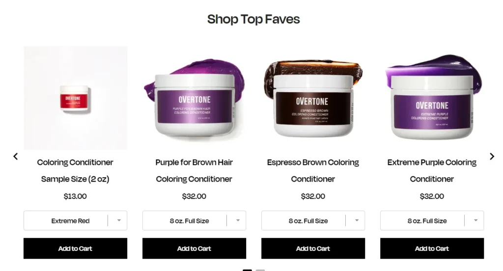
You can include a variety of these grids that group your products in different ways. For instance, oVertone highlights some of their top sellers:

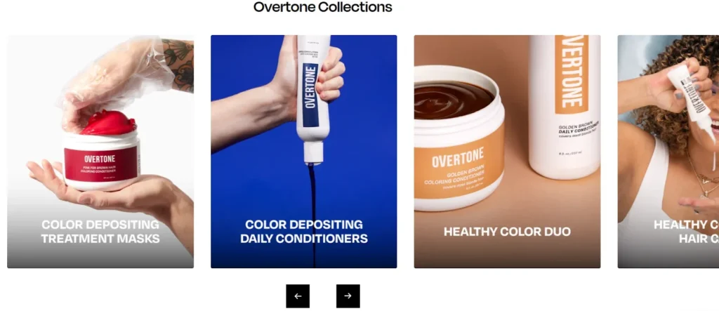
Then they also call out some of their top categories:

Think about how people shop for your product, and make it easy for them to find the products and categories they want right on the homepage.
For instance, a clothing store might highlight the different types of clothing they sell (pants, shirts, etc.), seasonality (fall, winter, etc.), color schemes, and so on.
#3 Weave in Storytelling
Your homepage is also a great place to do a little storytelling — especially if it helps highlight what’s unique or compelling about your brand.
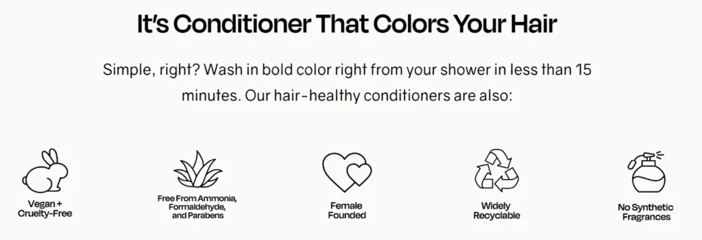
This could come in the form of an “About Us” section, educational resources, or a section highlighting some of your brand values, like this screenshot from BOOM!:

And this one from oVertone:

Just don’t take up too much room with storytelling. You still want the main focus of your homepage to be directing users to product and category pages.
#4 A Safety Net
Your homepage will inevitably attract some users who are interested in your brand, but not quite ready to buy (or even browse).
For these folks, make sure to include a newsletter opt-in at the bottom of your homepage with some kind of lead magnet offer, so the viewer can at least choose to receive new content and promotions.
Smart Marketer does a great job of this at the bottom of our homepage:

Introduce Some Variety Into Your Homepage
This is a great formula for creating a highly effective homepage, and it’s flexible enough that you can customize this formula to fit your brand.
After all, every homepage is different. That’s because every brand is different — with different products, different customers, and different needs.
For example:
- Some companies might have a huge product catalog (think Amazon). These brands will probably show lots of product grids and sliders on their homepage.
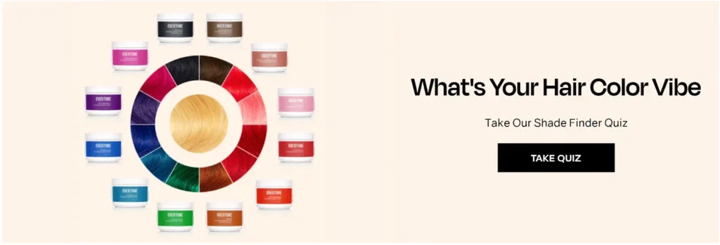
- Meanwhile, stores with fewer SKUs might focus on 1 or 2 best-sellers. oVertone’s homepage is a great example of this: it has a “Shop by Desired Color” section that wouldn’t make sense for other companies, but is a perfect fit for a hair color brand.

And for those visitors who aren’t sure what hair color they want, oVertone follows up that section with a quiz designed to help them find their perfect color:

The take-home message here is to think about how users shop for your products, and give them the categories they need right on the homepage.
Avoid this Common Homepage Mistake
Sometimes, people try to be cool by creating a super minimal homepage with a splashy image and just a teensy bit of text. This is the kind of thing you see in luxury brands like Dior:

I think people do this because they think it will stand out and grab attention. Unfortunately, it does the exact opposite.
Unless you’re one of those luxury brands (where a homepage like this might fit with your customers’ expectations), homepages like this typically fail to engage visitors — and that’s especially true on mobile, where a homepage like this is more difficult to navigate.
Instead, you’re better off building out a homepage with some substance to grab your visitors’ attention and get them interested in your products.
Final Words of Homepage Wisdom
A couple more thoughts:
- For many visitors, your homepage is the first page they see of your website. But that doesn’t mean it has to be the first page you create.
In fact, because your homepage is an overview of the entire site, it’s helpful to make your homepage last, once the rest of your pages are already created. If you follow this approach, the homepage will be much easier. - Last but not least, don’t over-emphasize the importance of your homepage.
Yeah, your homepage is important — just like all your high-traffic pages are. But it’s not hard to get this page right.
Just stick to the layout you learned on this page, make sure to feature your best-selling products, and try to communicate what’s unique and compelling about your brand, and you’ll be well on your way to a highly effective homepage.
This was just a small preview of my course, Smart Ecommerce, where Kurt and I teach you my entire system for building and scaling ecom brands to 8+ figures.
It’s been fun. Thanks for reading!

